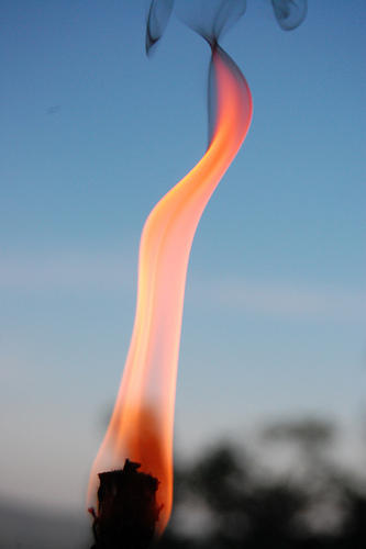
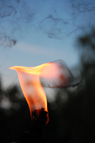
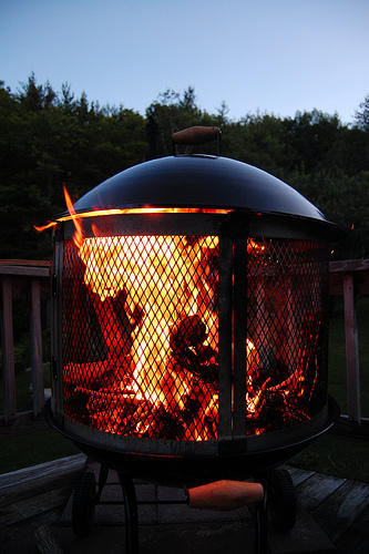
I like the first one. the hint of the smoke with the cool shape is nice. Composition wasn't there though. I think you could have gotten away with angling the camera (because there is next to no background objects to orient the image). I would have made it so the burning object was more in the lower left corner with the flame on a slight diagonal to the left. This would have also given you an extra inch or two of smoke which would have been perfect. I would also like to have seen a little more detail at the base of the flame (i.e. lighting focused on the tip of the torch): just a little, so it isn't just a black mass mixing with that bit of tree in the background.
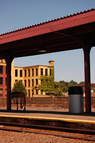
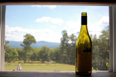
Last one feels a little boring, but lighting object and trying to drop the exposure to darken the background would be nice. My eye wants to look at the background and isn't drawn to your subject at all. When I force myself to look at the bottle, I want to look away because I see absolutely nothing of interest. There is a label on it, but it's too dark to be of any significance and I can't look at it, which makes me angry because I want to read it. It's like it's tempting me, but giving me nothing. Tempting can be good, but give me a little something; I'm not left wanting more, because I got nothing.
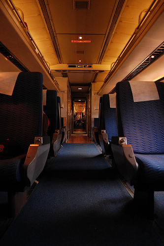
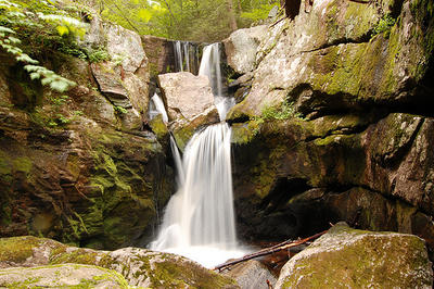
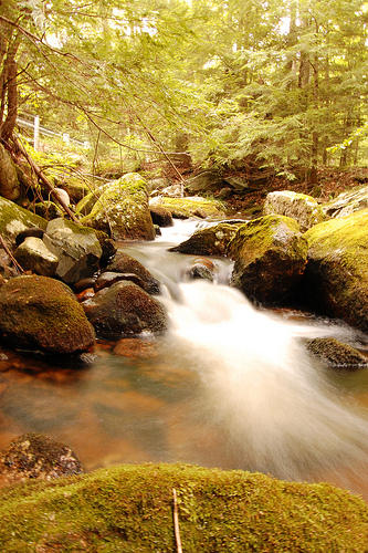
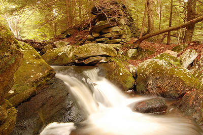
Hope that makes sense. The water ones are cliche, but could be okay (they'll never be great because they're so common), with the improvements mentioned above. I forget the others. I don't think they were bad, just not memorable.
