It looks like you are using an ad blocker. That's okay. Who doesn't? But without advertising revenue, we can't keep making this site awesome. Click the link below for instructions on disabling adblock.
Welcome to the Newschoolers forums! You may read the forums as a guest, however you must be a registered member to post.
Register to become a member today!
RubberSoulsee i think that's the problem i have with what youre saying-- i think youre implying that the tangible, functional improvements of this update (which are great from what i can see) NECESSITATE the change in the FORM of them, when really it is just the specific route you guys chose to take
this can be analyzed and argued in the examples of ebay, gmail, etc also, but that only comes down to intangibles and pointless arguments because it boils down to semantics and subjectivity
regardless, the decision is made obviously so i guess ill just wait and see if it grows on me. if not, ive been wanting to get into TGR anyway, or hell, maybe i could even try working without checking ski forums once an hour..now there's a crazy thought
They do change some of the form yes. When you totally upgrade a system to work completely differently across mobile, tablet, desktop, blackberry whatever the fuck it does change everything. You roll with it and blend in some improvements to try and match the old and the new. It won't ever be absolutely exactly the same, so you update it a bit. You toil endlessly about what will be best for the userbase as a whole, as you're not just thinking about one usage scenario. you then do your best to roll it out properly and balance reactions, in addition to taking feedback. A great deal of the time with layout/color changes users don't actually leave they adapt very quickly, or a couple of small tweaks solves their problem.
If you read that article you'll also learn that usually the problem is functionality way more than design, the design just feels shocking.
It also isn't as much subjective or semantics - its actually hard numbers and data. If we see a drop in usage, then you're right and I'm wrong. If we don't, then I'm right and you're wrong we just made people angry. That is the key to all of this - its a mathematical science but comes fraught with emotion.
If you actually think that a color change is worth a rage quit of Newschoolers and a move to TGR, then I'll be sad to see you go. I have a feeling that the culture and usability would be way more of the actual underpinning reason though, and if you're actually leaving its for different reasons than the color.
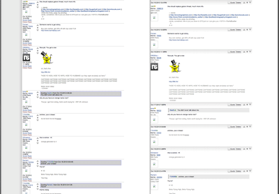
ERICA.MN@Bishop, basically on mobile it reverts to the desktop settings, except zoomed in to (zoomed to full screen below). also in LM whenever I click the (page 43) part next to the thread (mobile, my threads), it goes right to page 1 instead of the last page
Ah whoops.... Ok I've entered this as another bug.
I'm getting used to the new layout after using it pretty much all day today, but I agree about changing the up/down vote to the left side, and the time of the post to the right. Also multi quoting needs a limit. You rarely need to quote more than three people at once, and leaving it unlimited will create a lot of pointless scrolling.
Another (small) thing that is bugging me is that in the box with the quoted text it says
Mr.Bishop: "Go fuck yourself."
I think it would look better if the quoted text started on line down from the name, like this:
Mr.BishopThey do change some of the form yes. When you totally upgrade a system to work completely differently across mobile, tablet, desktop, blackberry whatever the fuck it does change everything. You roll with it and blend in some improvements to try and match the old and the new. It won't ever be absolutely exactly the same, so you update it a bit. You toil endlessly about what will be best for the userbase as a whole, as you're not just thinking about one usage scenario. you then do your best to roll it out properly and balance reactions, in addition to taking feedback. A great deal of the time with layout/color changes users don't actually leave they adapt very quickly, or a couple of small tweaks solves their problem.
If you read that article you'll also learn that usually the problem is functionality way more than design, the design just feels shocking.
It also isn't as much subjective or semantics - its actually hard numbers and data. If we see a drop in usage, then you're right and I'm wrong. If we don't, then I'm right and you're wrong we just made people angry. That is the key to all of this - its a mathematical science but comes fraught with emotion.
If you actually think that a color change is worth a rage quit of Newschoolers and a move to TGR, then I'll be sad to see you go. I have a feeling that the culture and usability would be way more of the actual underpinning reason though, and if you're actually leaving its for different reasons than the color.
_______
re: form vs function: well, right, that's most of what i was saying. the function has to dictate much of it but there's plenty of leeway on the form side and im sure you guys will do plenty of tweaking. mostly i just resented the implication that form and function here were one and the same and left no options besides garish white 2000 style forums
re: objective vs subjective: see but that's what i was referring to-- you can't point at the numbers NOT DROPPING as evidence of you being right and me wrong.. that could just as easily mean that people are just dealing with it because they love the site blah blah blah. which is great, but that does NOT prove that the form the update took was "correct" in an objective way.
i dont see why you insist on still referring to my feelings here in such reductive descriptions like "think[ing] a color change is worth a raqe quit of NS" when ive been pretty clear about why that's not an accurate portrayal of what ive been saying. no sense in writing them again i guess
whatever, things change, i'm sure you guys will keep up the good work. i just think it's a huge mistake to overlook the fundamental aesthetics of a site as if it's some little detail
Do you have thoughts on what Andrew and I said above?
Threw the suggestion into our product software, and they'll look at it when they get to it. I suck at Dev, so it'll be Mousseau and NoPoles that do this.
Currently NoPoles is fixing bugs, etc and will get around to the graphical changes soon.
to be honest the more i use it the more i look the new format...those saying they will ragequit or the guy threatening to kill staff are being a little dramtic in my opinion. the internet is a serious place i guess!
The old forums were just as white. Just took a look at them on one of our archive servers.
What do we do now?
We can't say the whiteness is killing us and that this 'generic' white look is retarded. Because the old forums were exactly the same.
Shift your suggestions to something else. We're trying to come up with a 'classic' theme.
I think what I liked about the old look was how clean it ws, the gradiants look odd to my eye along with the extra padding everywhere. The old forums looked so clean IMO and the quote box looked better as well.
pussyfooterI think what I liked about the old look was how clean it ws, the gradiants look odd to my eye along with the extra padding everywhere. The old forums looked so clean IMO and the quote box looked better as well.
So basically the whole 'whiteness' argument is completely invalid. As a matter of fact, the gradient added less white to the new layout.
The text changed, which definitely un-compacted things but we removed that.
The biggest difference is that we took a bunch of stuff from the left (as starting to stack multiquote under the other stuff got really big) and then put in the bar between posts. So this added spacing in between posts. The quote box is a bit different too, but frankly I think the new one looks better.
Its not white, its text and post spacing. We've changed text now so that is the same.
The bottom line is that its only the gradient / post bar you guys aren't liking. Look at this objectively, everything else is exactly the fucking same.
Look at the old forums and look at the new ones. Really look at it, and really ask yourself what you don't like so we can get this solved and move on to cooler stuff!
I don't know if it's just me having this problem but on my iPad I can't upvote or downvote thread posts. It says I need to be logged in to vote but I am logged in.
Like I said, the gradient and the padding feel weird to me IMO. I think kids are freaking out about a blinding white because there is less filling in the white? I get the same feeling they do, the older forums has less negative space, I think thats what I like/miss the most.
i would say just remove the gradient. why is it necessary? it seems that's how it was before, and with the two side by side, old NS looks much cleaner without a gradient in between posts.
Mr.BishopSo basically the whole 'whiteness' argument is completely invalid. As a matter of fact, the gradient added less white to the new layout.
The text changed, which definitely un-compacted things but we removed that.
The biggest difference is that we took a bunch of stuff from the left (as starting to stack multiquote under the other stuff got really big) and then put in the bar between posts. So this added spacing in between posts. The quote box is a bit different too, but frankly I think the new one looks better.
Its not white, its text and post spacing. We've changed text now so that is the same.
The bottom line is that its only the gradient / post bar you guys aren't liking. Look at this objectively, everything else is exactly the fucking same.
Look at the old forums and look at the new ones. Really look at it, and really ask yourself what you don't like so we can get this solved and move on to cooler stuff!
AS eheath said, you added more padding, compare how condensed the old forum was. It was also very simplistic. It was more compact as the information about the post was over by the icon which eliminates the extra space as pretty much any length of post would be long enough to cancel it out in a way. If what im saying doesn't make any sense I can try to throw together a visual. Just the post/thread info is all spread out now which creates a need for more space which makes things just bulkier/bigger.
You know what we should do? We should all stop talking about this, and just use the site the way it is for a week or two. After that, we can start to talk about it again. I feel like right now we're all getting caught up on semantics that really don't matter; we're just not used to it, that's all.
I feel like if we just used the site for a couple weeks, and then it got switched back to the old one, we would all want the new one back.
brotoi would say just remove the gradient. why is it necessary? it seems that's how it was before, and with the two side by side, old NS looks much cleaner without a gradient in between posts.
.Andrew.AS eheath said, you added more padding, compare how condensed the old forum was. It was also very simplistic. It was more compact as the information about the post was over by the icon which eliminates the extra space as pretty much any length of post would be long enough to cancel it out in a way. If what im saying doesn't make any sense I can try to throw together a visual. Just the post/thread info is all spread out now which creates a need for more space which makes things just bulkier/bigger.
One reply speaks to both -
I have a feeling that its not the graident that is the problem, its the bar above each post. That is definitely a couple centimeters per post that were added.
Now note, on mobile there is zero other way to add these features in without putting them up there. You'll never get them 'clean' in any other way that you can actually use with your fingers.
So really this is the crux of it. The majority of what we were doing here was focused on getting the mobile platform up to speed. We're using responsive design so its only one template not two, and instead of having the items move from the left up into that bar - all of us after a few days of testing started to like the stuff up at the top.
Look at this thing on mobile. No way you'll have a useable look if you want to give multiquoting, voting, etc with it rammed all in the left. Total disaster.
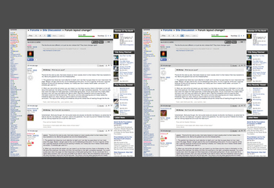
Alright, making progress here's two of the same thread, lined up and old/new side by side.
What this is about is the height of the left side. For mobile its a no brainer, we can't increase that left side shit rammed in so we need to go with the bar on top. Done deal.
For desktop, to give you multiquote we'd have to add another button on the left. For a thread full of short posts, this would increase line height overall, as with the new bar we saved on the left but gave up on the top. For this thread, it actually would decrease the overall length of the page by a tiny bit.
What I think everyone is complaining about is the fact that the old layout had the posts tucked right up into the thread separator. Now there is a break in that, which can feel like it busts up the flow of power reading something.
We could do a classic look / new look. We also could just say fuck it, add multiquote under quote and keep stacking shit up on the left anytime we want new features. We make it shift on mobile to keep that bar at the top as there isn't another really elegant way.
After looking at that comparison there are two things I can see that would make the new look look better:
- Quotes should look the same, in the grey box with blue border. The new quotes remind me of long chains of email replies haha
- Sigs have gotten bigger. I think it's the line spacing, but sigs should be as compact as possible.
Is it not possible to have different layouts on computer and mobile? Leave it as is on mobile, it looks awesome there, but on computer tuck the quote box where the quote button used to be and the up/downvote buttons back where they were. I think that'd look fine.
Also quoting is super buggy, it's really easy to change the quote without noticing and you get error messages for apparently no reason...
The look of the forums reminds me of windows xp or osx from 6 years ago with the new "glass" style buttons and the gradients. I thought the new trend in web design were more about minimalism and solid colours.
Anyways I honestly don't really care, I am fully capable of doing what this site is designed to do; talk about skiing and being a dickhead.
pussyfooterI think its all about whatever works best technically, I like the older style better of less padding, but im just one person.
Technically and design is a balance. That's what we're doing here.
*DUMBCAN*After looking at that comparison there are two things I can see that would make the new look look better:
- Quotes should look the same, in the grey box with blue border. The new quotes remind me of long chains of email replies haha
- Sigs have gotten bigger. I think it's the line spacing, but sigs should be as compact as possible.
Is it not possible to have different layouts on computer and mobile? Leave it as is on mobile, it looks awesome there, but on computer tuck the quote box where the quote button used to be and the up/downvote buttons back where they were. I think that'd look fine.
Also quoting is super buggy, it's really easy to change the quote without noticing and you get error messages for apparently no reason...
Sigs have not gotten bigger - optical illusion from the post spacing.
Blue border is a good call, adding that back.
Its possible to have different, but what we're moving away from is two totally different sites. That is very old style, and is why the mobile site didn't have a lot of functionality. We can bend this, but only so far.
brotowhat is the deal with replys not showing in threads for a couple minutes?
Known issue. Please read all posts in thread before making further suggestions, we've handled a lot of shit that is getting reposted.
______
Also - so basically we can move all the stuff up top back over into the left on desktop but - when we add multiquote (or future enhancements people might want) that will keep growing taller and taller.
Anyone able to mock this up, and add something for multiquote?
If we make this change it'll take some time but we don't want to keep flip-flopping.
It looks so old and retro now. I miss the grey boxes with the black vertical bars next to it. Bring back the old style. This is lame. I'm not coming back.
CaptainDickbuttIt looks so old and retro now. I miss the grey boxes with the black vertical bars next to it. Bring back the old style. This is lame. I'm not coming back.
Thanks for the side by side, that really helped pin down exactly what it is that makes it feel less readable to me. Mainly the gradient bar and the timestamp/flow.
1. The gradient bar draws too much attention to itself, and I can feel my eyes drawn to it as I read down the page. Maybe I will get used to this, but it's distracting at this point. I'm not a huge fan of the bar in general because of that and the spacing it creates, but I totally see how it makes mobile better. conclusion: I'll probably get used to it
2. When you look at the old version you can break it up into three columns: there is information on the left about the post/user, the rating, and then the post text on the right, completely separate. You could quickly scan down the page and read responses uninterrupted going down. Or you could scan for a highly rated comment, then your eye just shifts to the right to read it. Now the timestamp overruns past the post information block and into the text area. The overrun and the extra spacing around it really makes the timestamp stand out, when what you want to stand out is the post text.
conclusion: The layout of the rating and timestamp disrupt the vertical flow of reading through the forums
hahahahaah. Seriously though, the new quote boxes are actually my favorite new feature, so personally I'd hate to see the new styles go. I've grown used to the gradients. You want my opinion? Delete this thread, act like nothing happened and crush the rebel scum.
usaceThanks for the side by side, that really helped pin down exactly what it is that makes it feel less readable to me. Mainly the gradient bar and the timestamp/flow.
1. The gradient bar draws too much attention to itself, and I can feel my eyes drawn to it as I read down the page. Maybe I will get used to this, but it's distracting at this point. I'm not a huge fan of the bar in general because of that and the spacing it creates, but I totally see how it makes mobile better. conclusion: I'll probably get used to it
2. When you look at the old version you can break it up into three columns: there is information on the left about the post/user, the rating, and then the post text on the right, completely separate. You could quickly scan down the page and read responses uninterrupted going down. Or you could scan for a highly rated comment, then your eye just shifts to the right to read it. Now the timestamp overruns past the post information block and into the text area. The overrun and the extra spacing around it really makes the timestamp stand out, when what you want to stand out is the post text.
conclusion: The layout of the rating and timestamp disrupt the vertical flow of reading through the forums
Key is to remember is that we split it up into three things - The Poster (left), stuff to do with the post (top) and the post itself (body). Don't confuse the gradient with the post management bar at the top - one is a design element but even without it you still get the same weird feeling. Correcting the gradient does not correct the fact that there's a post bar... as a matter of fact without the gradient it looks even weirder.
If we ditch the top bar on desktop it will start stacking things up on the left higher and higher. If we have future information we'd like to put in about a user (say gear they ride, links to videos, or whatever I don't know) then we couldn't easily stack more about the user there.
Not to say I think we shouldn't just stack up on the left and move on, but I at least want to make sure we're all looking at this rationally. This is what its like to make changes to a website, you have to balance what you want to add vs. how much that will work in the 'old' way you used to do it.
1. Change the gradient to a solid light gray box.
2. Reorder the user info so username and icon are together, with everything else under.
3. Bring back post preview.
4. ???
5. Profit
I personally prefer the gradient than the second option you proposed. With the second option, it's harder to tell if the info that is located within the grey area (i.e. up/down votes and such) belongs to the post above or below. Obviously we all know that it corresponds to the post under it, but if you just look quickly it becomes more confusing to the eye.
Bar_DownI personally prefer the gradient than the second option you proposed. With the second option, it's harder to tell if the info that is located within the grey area (i.e. up/down votes and such) belongs to the post above or below. Obviously we all know that it corresponds to the post under it, but if you just look quickly it becomes more confusing to the eye.
Slightly thicker grey bar at top needed then...
It's impossible to see that on a tiny thumbnail though.
I know this was mentioned before, but not sure if it was answered.
Is there any chance the black username in the quoted text will be clickable, taking you to the original location of that post? Sometimes it's useful in a thread with hundreds of pages, and you can go back and see who else replied to or quoted that text.
JStrathernI know this was mentioned before, but not sure if it was answered.
Is there any chance the black username in the quoted text will be clickable, taking you to the original location of that post? Sometimes it's useful in a thread with hundreds of pages, and you can go back and see who else replied to or quoted that text.
Best part of updates is that we can do anything now. :)
Nacho_Macho_manQuote box looks great now! Really loving it. Just move the upvote back and it will be great!
JStrathernI know this was mentioned before, but not sure if it was answered.
Is there any chance the black username in the quoted text will be clickable, taking you to the original location of that post? Sometimes it's useful in a thread with hundreds of pages, and you can go back and see who else replied to or quoted that text.
1. Please move upvote back to right, its the only thing that i still notice now, ive more or less gotten used to the gradient but the upvote on the left just messes up the flow
2.This would be a very very nice feature to have
Overall now that the quote boxes are back to normal i think i like this update!
i have to say that full res clicky photos are awesome - it even works on mobile too! no more "WTF IS IN THIS PHOTO WITH THE ABSURDLY AWKWARD ASPECT RATIO??"
JStrathernI know this was mentioned before, but not sure if it was answered.
Is there any chance the black username in the quoted text will be clickable, taking you to the original location of that post? Sometimes it's useful in a thread with hundreds of pages, and you can go back and see who else replied to or quoted that text.