With the new ski season achingly close at hand, the NS staff have been hard at work on our annual summer upgrade, coming soon to a Newschoolers near you. We wanted to give you a heads up on the changes that will be coming and show off some of the fancy new features. While we haven't gone crazy with new things, we're hoping the tweaks that we've made will make the site that much better to use. Launch of the upgraded site should take place on the 15th of August, but until then here's a sneak peek.
Site Centered with new Backgrounds
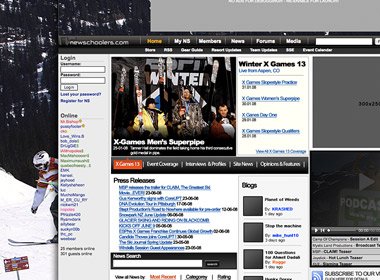
Probably the most noticeable change is the fact that the site can now be centered in your browser. Your account settings will now allow you to select left justified if you like the old fashioned way or are working on a smaller display, or centered for the new format. Taking advantage of the new layout will be high quality backgrounds that are maximized for even the largest displays.
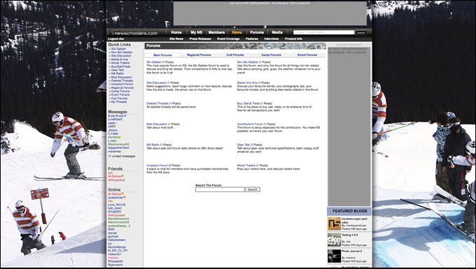
The site can now be centered in your browser, and we've spiced up the available backgrounds for larger displays.
New Header & Navigation
Though we're sticking with the same two-level navigation that the site currently uses, we've simplified the options and will be styling it to make it as easy as possible to use. We've spent a lot of time working on home-pages for each section that will showcase more of what the site has to offer, especially member-created content.
Right Side Bar
After much debate and meditation over the issue the right hand side bar is being removed. We'll still be using a similar layout as currently exists on pages like the forums, but other sections such as the News will be taking advantage of the extra couple of hundred pixels in width for pictures, videos and other media. Don't worry, we're keeping the Quick Links, which will be moving to the top of the left side of the page.
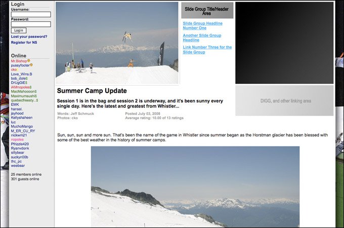
The Articles display now has much more room for larger photos and videos.
Member Articles & Regional Upgrades
With all the great member content constantly flowing through the site we're adding (or bringing back, depending on how far back your memory goes) a Members Article section that will let everyone contribute the latest news from their area. Articles will be tagged geographically and as the content library grows, we'll be able to provide news to each member on a local level. The Regional settings have also been upgraded and we'll be adding local news to areas like the regional forums as the season progresses.
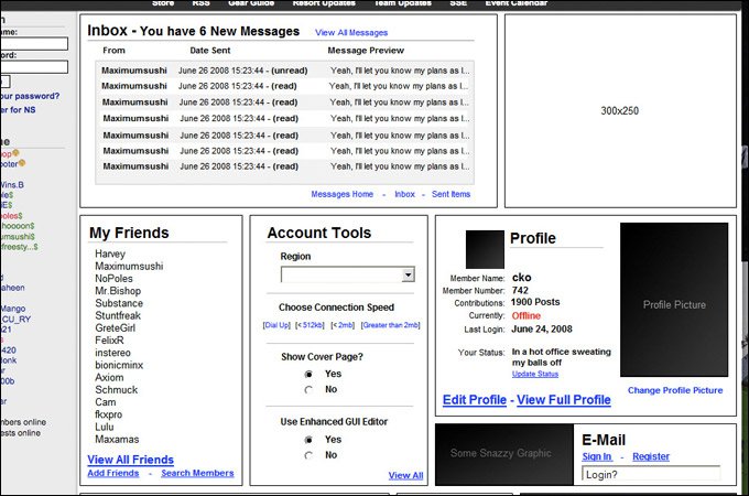
We've created home pages for each major section in an effort to more easily display all the features the site has to offer. Check out the new PM Inbox preview!
Still To Come
After our mid-August upgrade we'll continue working on a few special projects that will launch in the Fall. We're building a Product Guide that will take over where the current Reviews section is now and include a slew of new features including live pricing information. The videos section is getting a full revamp, jumping into this century with the addition of automatic conversion and embedding of member videos to flash(!). And we'll have the first version of our mobile-specific site to show off.
That's all for now, stay tuned to the site over the next couple of weeks to check out all of the new upgrades.
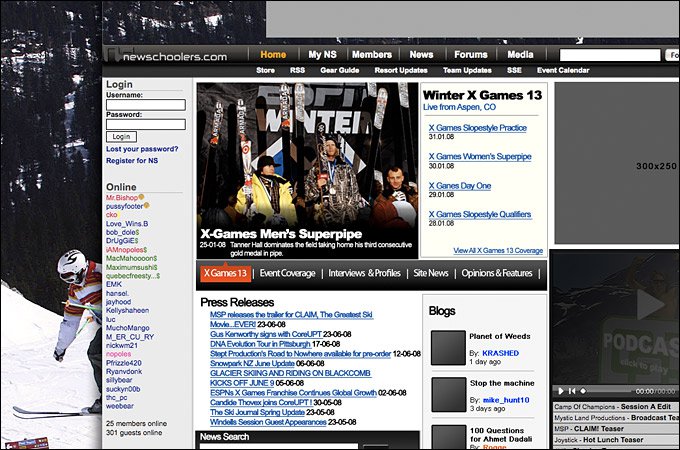
The News also gets an upgrade with a revamped category display.

Comments