As some of you know, I am the web developer behind the Penn State Snowboard Club (PSSC) website. I built the site from the ground up 3 years ago when I was attending Penn State. The website has evolved a lot since then and has signed up over 1,200 users. The past couple months I have been working on a complete redesign of the site. The goal was to make the site more useful for club members (and officers) and to add some design flare to spice things up a bit. After lots of hard work, I was able to finally launch the new site last weekend. The site seems to have generated a lot of positive buzz so far and I wanted to take some time to highlight a few new features.
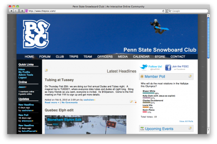
The new homepage of the Penn State Snowboard Club.
Let’s start with the new design. For those familiar with the old site (photo below), you will notice some drastic changes. I set out to bring more color into the new site and I wanted to emphasize photos since they are often the best way to liven up a site. I decided to go with a custom designed header photo for each of the main pages. Each menu item has a unique header (and color) associated with it. I think this has made a difference in the user’s first impression upon visiting the site. In addition to these changes, I also changed the primary link color from a maroon to a vibrant light blue color. I’ve been a fan of the light blue and black color schemes lately and I think it works great on this site. Finally, you’ll notice that I dropped the boxes around the elements on the right sidebar. Instead, I used a slight variation in the background color to differentiate these items from the blog entries in the center.
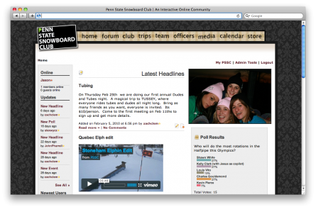
This is the homepage of the old PSSC website. It’s very boxy.
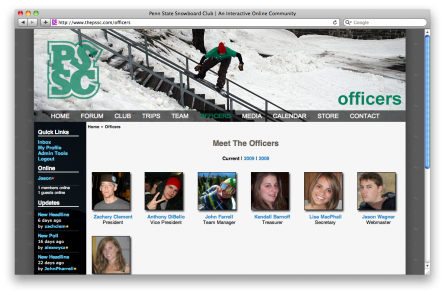
Officers page with new header image and the green color scheme.
In addition to these design changes, I made some other improvements to the sidebars on the homepage. The left sidebar is now displayed on each and every page of the site, instead of just the homepage. This will allow users to see who’s online while they’re browsing the forum or calendar and not just on the homepage. Big thanks to Ben Birk who provided the gorgeous photo for the left sidebar background. On the right sidebar, you’ll notice a new Upcoming Events section and a Recent Tweets section. The goal of the new Upcoming Events section is to present a clear and straight-to-the-point view for seeing what’s happening in the club. Previously, there was just a calendar with highlighted dates that you had to click on before seeing what the event was about. The new design explicitly shouts at you “This event is TODAY”. The Recent Tweets section is a way to get some of the new members familiar with Twitter if they aren’t already. Many of the most active club members are actively using Twitter.
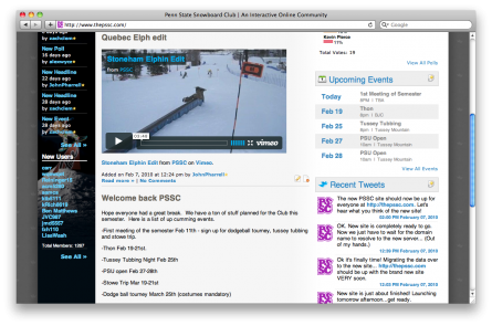
Upcoming Events and Recent Tweets sidebar items.
Another huge feature that I rolled out with this release is a completely revamped Inbox/Messaging page. The old site allowed a very simple way for members to send Private Messages (PMs) to each other. If you had a message waiting for you, a notification in the sidebar allowed you to open a pop-up with that message. There was no central place to view your messages. To compose a message, you had to find that user’s profile page. Well, with the new site I’ve built a GMail-like Inbox page. This page is 100% JavaScript and allows the user to navigate their Inbox, Sent Messages, and even compose a message to other members. This was quite a task, but I think it turned out extremely well!
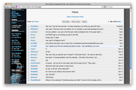
Brand new Inbox design to view your PMs.
I also spent some time working with the Video page. This page previously displayed a thumbnail (added manually) of each video and linked directly to that video which was hosted on the server. In actual use, this was very clunky. The team members were simply hosting their videos on Vimeo or YouTube and posting links in the forum or on the homepage blog. I wanted to create a dead simple way to add a video. I came up with a simple form where the team member or officer could simply post a link to the video hosted on Vimeo or YouTube and the code does the rest. For each of these links, I used the video site’s APIs to fetch all of the relevant metadata about the video (including the thumbnail) and then I display it on the video page. This allows the page to be completely dynamic and saves the user the hassle of entering all the information twice. To help speed things up, I used memcached to keep the video metadata in memory so I can quickly load the page without waiting on these APIs.
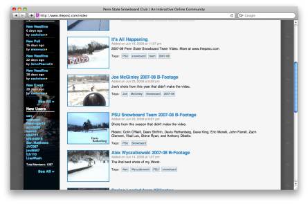
The new Video page.
Finally, I made a lot of performance enhancements under the covers which should drastically improve the performance of the site and keep the code looking modern. I started by moving the site over to my brand new server hosted by Linode in Newark, NJ. This server flies in comparision to the shared server where was previously hosting the site. I also made heavy use of memcached to cache a lot of the data on the site that changes infrequently. This allows me to make less queries to the database and in turn, I’ve seen an incredible improvement in speed. Speaking of less database queries, I introduced a brand new database class which should greatly enhance security against SQL Injections and similar attacks. Overall, these improvements have made a very noticeable difference in site performance.
As you can see, I’ve been very busy. I couldn’t have done it all without the help of my buddy and former PSSC officer, Kenny. He has provided hours and hours of his time to help me test out these changes and get the site ready to go live. His attention to detail and high standards have greatly affected the outcome of the site and the club members are going to benefit greatly. (Thanks Kenny!) I hope you enjoyed this little tour and feel free to ask any questions you might have in the comments. I’d love to get some more feedback. Also, if you want to check out the site for yourself, it’s easy to browse it without creating an account. I’ll leave you with one last photo, and a link.
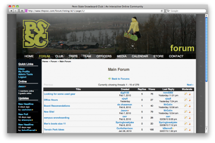
Here is the Forum. This is the most popular section of the site.
Penn State Snowboard Club – http://www.thepssc.com
Note: All of these screenshots were taken from my ADMIN account on the site. None of the New/Edit/Delete icons will appear for regular club members.

Comments