A quick word on blocking ads

It looks like you are using an ad blocker. That's okay. Who doesn't? But without advertising revenue, we can't keep making this site awesome. Click the link below for instructions on disabling adblock.
Welcome to the Newschoolers forums! You may read the forums as a guest, however you must be a registered member to post. Register to become a member today!
KungKalmarWooden topsheets without graphic are the best. Blanks are nice too. I usually prefer simple graphics or no graphics at all but you can't go wrong with airplane themed graphics.
Moment deathwish has had one of the best graphics in the past, It might be the 2023 model. Right now they are complete trash. The special edition nightstick 97 with dark topsheet and purple bases looks good.
Anything with orange should be burned down.
FruitBootProThe entire industry is abstract, modern pop art or plain color/colorblock at the moment...
We need something that has the same vibe as Ninthward and Hellbents but with a more contemporary, esoteric flair
I think Surface and Vishnu are nailing it right now.
lil.BoyeIt’s hard for me, i don’t know what i like, but i know what i like when i see it. Plain skis are usually sexy, but some just look cheap.
imo the past couple years have been pretty bad. Less soul, more corporate bullshit that gives out a «i don’t care what i look like» kinda vibe.
I have seen some 2025 skis i really like though, it might be a comeback for good graphic design.
I hope for no more madsteez armadas though. They have never done it for me, and have stopped me from getting armada for a long time.
270on420outAm I the only one who thinks Armada’s graphics have gotten generally worse over the past few years?
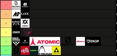
CRtrailingWe need to get rid of the "millennial" ski graphics. Calebsiphone explained it well with companies like J skis right now in his brand tier list video. (No hate to J skis tho, dope brand) Personally, I really like the edollo and B dog graphic for this year. Can't say the same for the ARV's though.