https://4frnt.com/blogs/blog/24lookbook
New Skis go live next week Tuesday, 8/8. We dropped the Lookbook early so you can check out new graphics before they go up. Check em' out, take the poll, and let us know what you think in the comments!
Welcome to the Newschoolers forums! You may read the forums as a guest, however you must be a registered member to post. Register to become a member today!
bustedpivotoh shit I didn't realize it was that creeper ass pedo dude.
GrandThingsI'm not saying they're the same, but it is absolutely analogous. The corny/shitty/copied graphics they put out every year highlight the fact that, just like Montec, they care more about making money than listening to community feedback and making cool products.
INB4 you say "wOwoW a CoMpaNy tRyInG to mAkE money"
I'm not trying to say this is a bad way to run a company, just highlighting this dissonance and pointing out how hypocritical they are when they post threads like this.
bustedpivotoh shit I didn't realize it was that creeper ass pedo dude.
J_skisVery insightful and constructive feedback thank you hahahah
Lenny-It really is constructive, brand image and the awful graphics are the biggest problem. You can keep your head up your ass though because obviously none of this matters to you, or the morons you sell to. 🤔
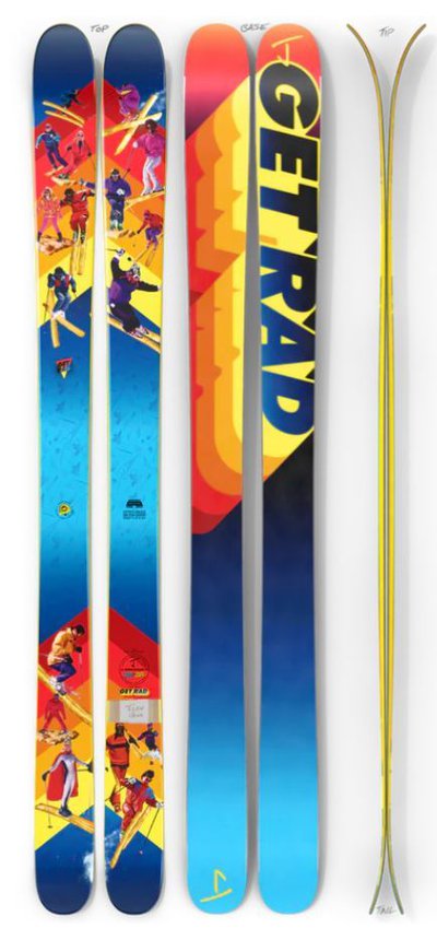
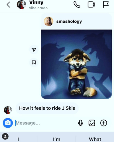
When I think of Jskis this is the sort of uncouth marketing that comes to mind. Hope this helps clarify things for you Jason.
hi_vis360total hardo cool guy
GrandThingsAnd there's the krux of this issue... You listen to CUSTOMER feedback, but pretend to care about COMMUNITY feedback. I agree, you're never going to please everyone, especially not the picky losers like us on Newschoolers - and if you did, you probably wouldn't be around very long.
But if you're asking for feedback, you can't post shit like "The reason we didn't include more "garbage" options in the poll is to discourage pointless comments like yours in the NS forum".
Your brand is cringe and your graphics suck. It is what it is. If that's what you have to do to thrive as a business, that's fine, just stop expecting us to suck your dick because you're a JLev company.
sskThanks for turning a conversation into your own ignorant spiral of pointless trolling. pull your head out of your ass and try to contribute something reasonably constructive...if you can
The J thing is a very interesting approach in the ski industry. It's impressive that they can look at the industry with such a range of lenses and create something for so many different skiers. I think you would be hard pressed to find many skiers that love every graphic, but this plays to the success as well. Something for everyone, but that something is a very unique piece of art, not an earth toned Fischer ski.
With 4FRNT, i find that the art direction is more unique than the rest of the industry but less dramatic than the J skis approach. They stand out on the hill, feel true to the brand, and give the skis character that's lacking in a lot of other topsheet design. This is the freedom you get when your not selling a million units a year.
Lenny-It really is constructive, brand image and the awful graphics are the biggest problem. You can keep your head up your ass though because obviously none of this matters to you, or the morons you sell to. 🤔
When I think of Jskis this is the sort of uncouth marketing that comes to mind. Hope this helps clarify things for you Jason.
GrandThingsPaying riders vs. royalties is another example here. Great for their company, not great for the riders. Similar issues with the whole Sander Hadley ordeal.
GrandThingsDog, I'm not trolling - they literally keep posting shit like "FEED ME" and I'm just trying to point out why I have issues with their company. I agree it's a unique and interesting approach to the ski industry but ....that doesn't necessarily make it a good thing. (Paying riders vs. royalties is another example here. Great for their company, not great for the riders. Similar issues with the whole Sander Hadley ordeal.)
I just often feel that they expect to blindly follow them and be like "yes yes 4FRNT and J skis are awesome!!" regardless of what they're actually doing. I was actually excited to take a look at this 4FRNT lookbook because I was hoping there would be some new and cools stuff - but there's not. Do you disagree that these new 4FRNT graphics look like copied graphics from other brands, or things that have been re-used every year?
If their graphics and approach to the industry are cool to you, that's great, but what really frustrated me is when they post threads like this or ask for feedback, they don't respond to the actual criticism.
J_skisFEED ME
J_skisNice! Great example of a campaign from 2 years ago that we definitely fucked up on, publicly and privately apologized for, worked with the people we hurt to remedy it, donated to the cause we were piggybacking off of AND learned invaluable lessons that inform our decision making process now.
Wait... who's got their head up their ass again?
**This post was edited on Aug 16th 2023 at 8:52:11am
sskI do 100% disagree with you that the 4FRNT graphics look like things that have done before...they seem to be onbrand for 4FRNT but definitely don't agree with you comparisons earlier in the thread. in fact, here are pollards graphics(https://ericpollarddesign.com/pages/ski-graphics) , i don't see any overlap at all except that he was also inspired by art on skis. I think you're just looking for something to get fired up about, so you're over there keyboard cowboying. but if you actually take a look at what has been done and what is being done, both these brands stand out as a positively unique anomaly in the sport.
SteezyYeeter
GrandThingsbut what really frustrated me is when they post threads like this or ask for feedback, they don't respond to the actual criticism.
J_skisNice! Great example of a campaign from 2 years ago that we definitely fucked up on, publicly and privately apologized for, worked with the people we hurt to remedy it, donated to the cause we were piggybacking off of AND learned invaluable lessons that inform our decision making process now.
Wait... who's got their head up their ass again?
**This post was edited on Aug 16th 2023 at 8:52:11am
Lenny-Still you Jason. This is just a single example of you being consistently out of touch and uncultured. Glad you actually listened to the feedback though rather than just keeping your head up your ass like you are doing here now. I'm sure that was really tough for you Jason.🙄
Farmville420I really like the bases on the devastators, the topsheets are pretty cool as well on all of em
hi_vis360Most ski companies don’t even have an NS account, 4frnt has responded to this thread multiple times, what exactly are you looking for?
SteezyYeeter
LonelyJskis X DopeSnow collab when???
signtime@4FRNT I really like all the graphics individually, but they look kind of mismatched when they're next to each other.
Presenting the graphics individually with ascribed human-like personalities that match their ride, like you would on the ecommerce website, makes them go really hard.
When they are all next to each other like "this is our new lineup" doesn't do them justice. Seems like a newspaper ad for a ski swap or something. On one hand, branding can help. On the other hand, people buy the 4frnt graphics and skis because they have such unique flavor, people can see a reflection of themselves in the skis.
SuspiciousFishAs a longtime 4FRNT guy here is my honest feedback.
First off dont put a poll without negative feedback options, its insulting and looks like a cheap marketing gimmick instead of actually trying to get feedback from your customers. Just please dont do that crap.
The Hoji Collection is dope and the graphics actually have punch which is cool. I have to say the concept of animal faces coming out of the skis is starting to get kind of stale though. I get you want to keep on the brand but we have seen that general theme for a few years now.
For the MSP collection its a little too muted and just looks like some sketched generic mountains. I get the audience for these skies is typically older but again the concept is getting stale. It would be nice to see some kind of redesign for next year that gets away from "You ski on mountains so we put mountains on your skis...". If you are going to do this at least pick some kind of iconic mountain that stands out or can be recognized.
The freeride collection is the weakest to be honest. The switch has some generic space design we have seen a lot before, I cant really tell what is going on with the devastators unless I really zoom in on them and the Inthayne is more or less the same motif we have seen the past few years centered around some obscure logger with a chainsaw. With all the cool art and artists out there you could have really done something unique and special and it feels like a fallback to a generic graphic.
All in all I really would like to see a refresh of the graphics and have some new designs. This year it seems its either a tweak of past years motif or just a fallback to a generic type graphic. I get its been over 20 years and hundreds of ski graphics we have seen before but I am sure there is something you can do to stand out or find some unique style.