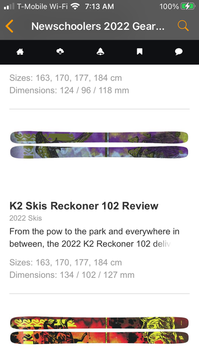
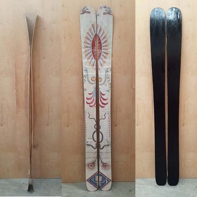
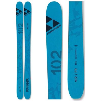
I do not know how graphic designer's teams for ski companies work but as all buisnesses I'm sure they faced challenges because of Covid. Altought they have accomplished their task and some might see it as an achievement in regards to challenges in logistics or management, etc. I can't help but feel, for the moment, disapointed. Since the age of "Thanos Dog" (shoutout @CalumSKI), I've always been amazed at Armada for what their company stood for : their creativity, originality but most importantly personnality (in their skis, pro models, etc) and their almost artistic but still "hip" way of shapping freeskiing and freestyle. Color is also something I admired about Armada, but this year, at this point, my perspective has started to change. Design in skiing in general, I feel, has started to lose it's magic, in a way. At one point I considered staying with Armada, for these reasons, as I hope to try their other models such as edollo or bdog. This is probably not the case for some but for many others, buying a ski is half for the characteristics, and half for the graphic (also the price). I'm using the edollo pro model in this case because it is a perfect example of how I feel like this years graphic just aren't showing the same magic they did the past few years. They have always had colorful designs with creatures and etc that represent the characters of bdog and edollo... and now? A white, blank ski with a few abstract design choices. I'm not writing this to tarnish the work of someone or offense others, but thinking about what I wrote, and imagining a situation where I'm thinking about buying the new edollo model... would I really want to spend almost 700$ not counting the bindings... on a ski that is almost only white? whith no personnality whatsoever?
Just my 2 piece


