It looks like you are using an ad blocker. That's okay. Who doesn't? But without advertising revenue, we can't keep making this site awesome. Click the link below for instructions on disabling adblock.
Welcome to the Newschoolers forums! You may read the forums as a guest, however you must be a registered member to post.
Register to become a member today!
This is a thing I think about and want to talk about way too much, so I figured it deserved its own thread. What graphics are you stoked on, who do you think phoned it in, what graphics do you not love personally but understand why they look like that? One thread for all of next winter's skis.
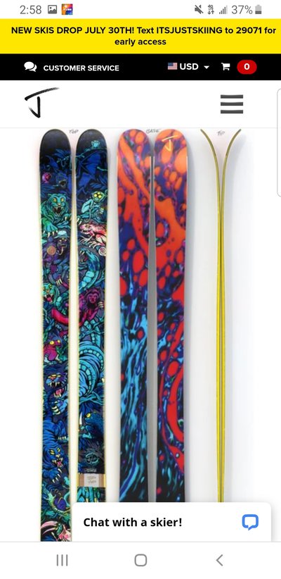
cydwhitDude! I meant to mention these, but then J drama derailed me. Holy crap! These are wild. My guess is that three people are going to love them and defend them with an aggresive intensity. To me they look like the worst combo of gas station/fantasy/airbrush art I've seen in a while. But I think most of my problem is actually with the color grade? Like I can imagine a slightly more muted, or maybe with a different hue or something version of these that is tolerable. But man, something about em makes me sad.
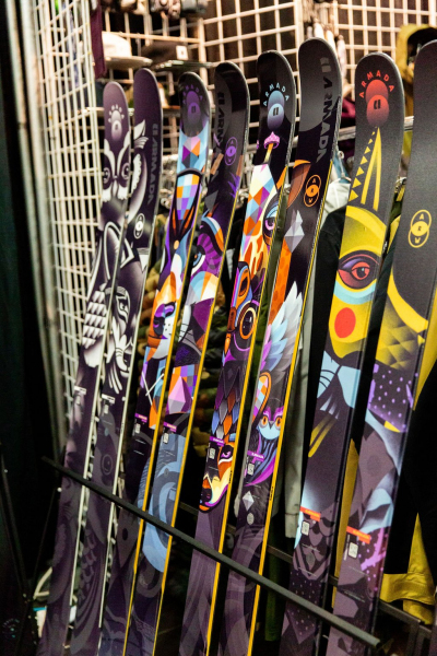
That said, Armada's Zero series has been really cool since they came out, and I think the new Whitewalker is the best yet. It's such a good fit for the whole marketing story around that line of skis.
Totally agree on both points. The zero series graphics are sick and perfectly fit the vibe of the line.
cydwhitYes! Pescados throw me all the way back, while still being fresh and new. Love 'em. And I think the Chetler gets better every year. Big fan.
I feel like I never love or hate Factions. They're usually clean, and just cool enough for my taste.
Agreed again. Factions never make me wanna throw what kinda ski I like out the window and just buy them for how they look (like bentchetlers and pollard stuff does), but I'd also happily rock them if I really liked the ski itself
Been following this thread since it started and I have to say I am pretty disappointed in J's response as well as his employee's. Cy made a constructive criticism and instead of taking that for what it was they decided to play the keyboard warrior game, bad look for Jlev and his company.
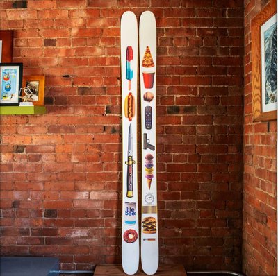
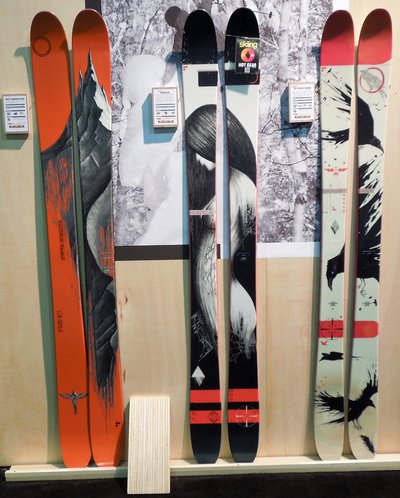
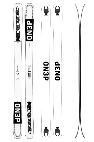
I think cy did a good job putting into words what I have thought about Jskis for a while. The best graphic that I could think of to represent this would be the freedom rock. I know ON3P has had some themed graphics, like the grizzlycorn, eh ski and America. I wouldn't buy those but I love the way they look. I guess when it comes down to it for me I am partial to topsheets that I look at and thin "Even if that wasn't a ski, I would want that art up on my wall"
The freedom rock looks like it's just there to cater to people who see a ski with a burger and a beer on it and go "Wow this ski has a burger and a beer on it, I like those things so I'm gonna buy it to show off for 3 days a season, that's so unique and edgy". I know a few of these guys, did no research on the ski, didn't really care about how it skied just wanted a ski with a gun on it. That's besides the fact that it looks like 12 pngs just slapped on a ski. I feel like if you get enough skis like that in your lineup and that's what you become known for, graphics that look more like a community submission competition than anything memorable.
Cy made a great point about how easy it to identify so many brands or even specific eras of brands based on the graphics.
Especially considering the relationship with line. Idk. When I think of the "Look" of jskis I just think photoshop or community submissions. I think of ON3P and I think of sick collage art. Moment? Beautiful symmetrical art. Line? Clean graphics with some awesome art from pollard. Armada? Very loud graffiti style graphics. K2? Clean retro graphics, with a history of having some of the sickest graphics ever (looking at schmies).
Idk where I am going with this, feel like I am rambling at this point. Art and graphics are subjective, but I can't deny the fact that I look at some jskis and just think....low effort. But I'm not an artist or ski manufacture so what do I know.
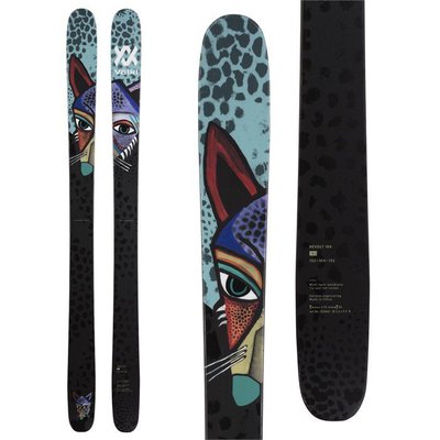
cydwhitYeah, I'm really glad Volkl tried something new with those animals. Personally I think a different color palette on the same design would have made those skis look way better, but I get what's going on there.
I used to HAAAATE the Vishnu photo graphics. And I'm still sorta bummed, but I've grown to accept them, and sorta understand what they're doing there haha. That one Wet 100% looks like an ad for a hard seltzer though haha.
I think Skevik has been low key killing the ski art game for a while. They're so cool, rode the lift with a couple who had them last year and couldn't stop staring the whole ride.
The fact that you disliked our graphics but they seem to have grown on you is pretty much what I am going for in a broad sense. I’m more concerned with the overall aesthetic being distinct from other brands rather than trying to please everyone.
cydwhitYeah. I mean, I didn't intend to start a "let's fight over J's graphics thread, but I guess that's what we're turning into here.
Ha! Damn...I shoulda realized how this was all gonna go. Sorry man. No fight whatsoever. Full respect and keep up the good work. I was just trying to give a little more context. Some like a story behind stuff, some don't.
Love the idea of some sort of yearly graphic contest that NS votes on. Let's get that shit going.
cydwhitHa. I was worried somebody actually in the industry would read this!
Disclaimer, I think you've released some of the prettiest skis on the market too, and I've really enjoyed riding a bunch of 'em, but here's how this current lineup makes me feel. And it's not related to what I think would sell or whatever, just on aesthetics.
Obviously this is subjective and different stokes for different folks, but here's a more articulated take, and I guess I won't pull any punches, 'cause it's the internet haha:
1) I get it that part of J is not having a cohesive look for the brand, there's a zillion different graphics with something for almost everyone, and all they have in common is who is making the skis. But I would almost argue that there is starting to be a cohesive look for "J Skis" and it's hastily done, low-quality graphics. Yes, there are a bunch of exceptions, but my friend group, and myself have all seen J's in the wild, not known who made them, but gone "that looks like somebody photoshopped some random crap on a ski, it's probably a J." Does that make sense? If I see a bunch of random crap on a ski, that doesn't necessarily look "crafted", I can assume pretty accurately who made it.
2) So many of these graphics don't look like they were made by skiers for skiers. I LOVE that you're doing artist collabs. But a bunch of those artists don't seem to have much experience working at the weird aspect ratio that skis have. So it looks like you're just taking their art and figuring out a crop that works on skis. Which adds to the "photoshopped" vibe. Again, stoked you're working with a bunch of artists, and I think they do great work. But much of it doesn't look like it's meant to go on a topsheet or a base. And that's a bummer. And yes, pot calling the kettle black, I'm not claiming to be a better artist or designer, just speaking from my seat as a critic/customer.
3) Graphics don't affect how a ski rides. They don't matter. And if you've got somebody out there who just wants a washed-out tie-die graphic with some peace signs, cool for them. But I don't think I'm alone in saying that great ski graphics are more than just art on a topsheet. They carry the legacy of a ski and a time in skiing on them. And yes, maybe skiing is moving away from that, maybe cool topsheets are going the way of full-length ski films. But man, every time I see a Pollard tree graphic out in the wild, it makes me nostalgic for a special time in skiing. I see a Hellbent at a yardsale and I remember the Pettit poster on my wall growing up. Hell, even old Salomo Czars, or Afterbangs, or whatever, they carry more weight than just the ski or just the graphic? Make sense?
And, harking back to point #1, good graphics tell me what brand made the ski. I don't have an encyclopedic knowledge of every Moment graphic out there, but I instantly recognize old Moments on the hill. Same goes for ON3P and Line, and a bunch of other brands. It's not because of the branding, it's because it's a ski that obviously came from the same visual family.
It feels like so many of the graphics I see on your site right now were designed to sell a few skis fast, and then not really be thought about ever again. Which is fine. But also makes me sad.
So yeah, stoked the brand exists, keep doing what you're doing. I love to talk ski graphics, and hear what other people like, and discuss why we don't like some stuff. So there ya go.
I feel like J skis has an industry position where the artwork can and must be done differently, similar to what World did with skateboards in the '90s;
but how does that translate for the ski community in 2020?
A World deck cost $40 so as a kid you could get one without anyone's approval. You could keep the graphic hid when it would get you in trouble. You could wear it out or sticker it when you were over it. So the artists had a lot more leeway re what was within the boundaries of acceptable taste. With J skis you're paying hundreds and there's an expectation they're gonna last you multiple seasons. The graphic is visible when you're in line for the chair with Ned Flanders and his kids. So it changes what art is gonna work best for this medium.
I guess JLev has a very good idea of what will & won't sell, but I imagine it's tricky to encourage artists to take their imagination further out into left field than the more corporate ski companies are willing to go with their graphics.
cydwhitDude! I meant to mention these, but then J drama derailed me. Holy crap! These are wild. My guess is that three people are going to love them and defend them with an aggresive intensity. To me they look like the worst combo of gas station/fantasy/airbrush art I've seen in a while. But I think most of my problem is actually with the color grade? Like I can imagine a slightly more muted, or maybe with a different hue or something version of these that is tolerable. But man, something about em makes me sad.
That said, Armada's Zero series has been really cool since they came out, and I think the new Whitewalker is the best yet. It's such a good fit for the whole marketing story around that line of skis.
Yeah, we are all becoming conditioned to color palletes. LUTS on movies, Looks on Instagram posts. All these create a feeling, when you see something like the Skis mentioned above they feel off because it kinda includes "too much of a pallete" and looses a cohesiveness feeling. deep down cywhitling we all know it just kinda reminds you of your Lisa Frank trapper keeper from middle school. COLOR WISE. Layout is pretty damn solid if you ask me, but what do I know.
MaxMillerYeah, we are all becoming conditioned to color palletes. LUTS on movies, Looks on Instagram posts. All these create a feeling, when you see something like the Skis mentioned above they feel off because it kinda includes "too much of a pallete" and looses a cohesiveness feeling. deep down cywhitling we all know it just kinda reminds you of your Lisa Frank trapper keeper from middle school. COLOR WISE. Layout is pretty damn solid if you ask me, but what do I know.
Hahahahah.
Totally agreed that we're all getting zoned into a specific look and color palette. And maybe that is why those bite my eyeballs. Also, why do you assume it's my Lisa Frank trapper keeper from middle school. You don't think I have one to hold all my ski industry hot takes in?
I bet those are going to look way better on snow, like they're gonna really pop and be neat in edits and such.
But you seem like the sort of guy who's just into astronauts and lava and occult stuff....
BiffbarfBut then there's the hackel pro model. Kinda looks like the in-school-suspension desk in a middle school. Not sure which mark this one hit.
from what i saw these are supposed to be customized/drawn on with a sharpie or something. which is a sick idea but then why not just make a blank white ski with the on3p logo on it? my artstyle definitely wouldn't go with what's on there currently
cyphersfrom what i saw these are supposed to be customized/drawn on with a sharpie or something. which is a sick idea but then why not just make a blank white ski with the on3p logo on it? my artstyle definitely wouldn't go with what's on there currently
I am in no way associated with Hackel or ON3P but in my interpretation the drawings already on the top were supposed to support the “doodling vibe”. I can’t remember if it was Hackel’s but the one drawn-on topsheet I saw a while back looked more like an artists notebook instead of one large drawing. I think he wants you to make a story out of your skis whether it’s with one large composition or you could have 20 different themes/sections across the screen. This may bother you as an artist but trust me, the first time I ride the lift or meet someone with drawn on Hackel pros I won’t care at all if your style deviates from the original design. I’ll probably just be super stoked to hear about your art if you’re willing to share.
dogfartstaintI am in no way associated with Hackel or ON3P but in my interpretation the drawings already on the top were supposed to support the “doodling vibe”. I can’t remember if it was Hackel’s but the one drawn-on topsheet I saw a while back looked more like an artists notebook instead of one large drawing. I think he wants you to make a story out of your skis whether it’s with one large composition or you could have 20 different themes/sections across the screen. This may bother you as an artist but trust me, the first time I ride the lift or meet someone with drawn on Hackel pros I won’t care at all if your style deviates from the original design. I’ll probably just be super stoked to hear about your art if you’re willing to share.
Right? Like now I want to get a pair of all-white touring skis and just put a visual journal of every day I ski on them along the ski.
Wait, damn, I actually want to do this, how many tiny paintings do I have to sell to afford all-white customs?
Agreed this graphic is insanely good. I agree with cy that sometimes J misses but as someone who already owns the metal and does not need to replace it because it rules...I still want to buy that ski cause the top sheet is so sick.
BigPurpleSkiSuitI will continue to fellate this graphic till I die.
BiffbarfBut then there's the hackel pro model. Kinda looks like the in-school-suspension desk in a middle school. Not sure which mark this one hit. I legitimately feel on3p released one of the raddest and one of the wackest topsheets this szn.
LonelyI think cy did a good job putting into words what I have thought about Jskis for a while. The best graphic that I could think of to represent this would be the freedom rock. I know ON3P has had some themed graphics, like the grizzlycorn, eh ski and America. I wouldn't buy those but I love the way they look. I guess when it comes down to it for me I am partial to topsheets that I look at and thin "Even if that wasn't a ski, I would want that art up on my wall"
The freedom rock looks like it's just there to cater to people who see a ski with a burger and a beer on it and go "Wow this ski has a burger and a beer on it, I like those things so I'm gonna buy it to show off for 3 days a season, that's so unique and edgy". I know a few of these guys, did no research on the ski, didn't really care about how it skied just wanted a ski with a gun on it. That's besides the fact that it looks like 12 pngs just slapped on a ski. I feel like if you get enough skis like that in your lineup and that's what you become known for, graphics that look more like a community submission competition than anything memorable.
Cy made a great point about how easy it to identify so many brands or even specific eras of brands based on the graphics.
Especially considering the relationship with line. Idk. When I think of the "Look" of jskis I just think photoshop or community submissions. I think of ON3P and I think of sick collage art. Moment? Beautiful symmetrical art. Line? Clean graphics with some awesome art from pollard. Armada? Very loud graffiti style graphics. K2? Clean retro graphics, with a history of having some of the sickest graphics ever (looking at schmies).
Idk where I am going with this, feel like I am rambling at this point. Art and graphics are subjective, but I can't deny the fact that I look at some jskis and just think....low effort. But I'm not an artist or ski manufacture so what do I know.
I've never been on a pair of any Pollard skis besides the Sakana (which was fun but too specific a ski for me to buy) but damn those graphics are timeless
Here's my plea to the industry: Give me the opportunity to do topsheet art and I'll come up with some sort of insane paint by numbers graphic that makes people really stoked on the brand. Seriously. I have ideas, this would be really neat!
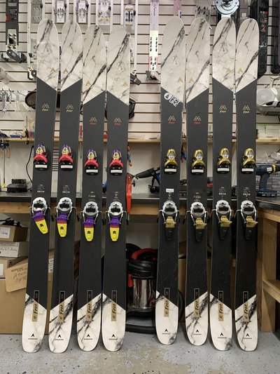
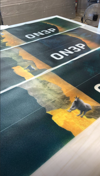
This year as expected there’s been a lot of positive feedback ON3Ps graphics. One bit of creativity that I think has gone unnoticed has been their new touring ski graphics, specifically the Woodsman and Jeffrey. Following the mountain theme and bomber theme of the two respective lines, ON3P also fit touring into the theme. Both feature an overhead map of what the regular ski graphic displayed bringing back the roots of land navigation in backcountry and touring. While this definitely wasn’t the most revolutionary or cool thing ON3P did this year it shows how much thought they put into the relationship of their graphics across and even inside the same year.
Tbh I was only impressed by a few graphics this year :/
my biggest hats off to Völkl tho, they really broke off of their usual stuff and I fuck with the new graphics a lot, the animals almost have a cubist look to em and I think they’re real neat .
BiffbarfBut then there's the hackel pro model. Kinda looks like the in-school-suspension desk in a middle school. Not sure which mark this one hit. I legitimately feel on3p released one of the raddest and one of the wackest topsheets this szn.
Am I the only one who thinks these are actually the sickest magnus topsheets this year?
Young_pattyTbh I was only impressed by a few graphics this year :/
my biggest hats off to Völkl tho, they really broke off of their usual stuff and I fuck with the new graphics a lot, the animals almost have a cubist look to em and I think they’re real neat .
I orderd revolt 121,104,95,87 just to have them match on the rack :p 95 is way to small for me but.. hey
pinkcamo1000I'm actually a no on this type of graphic, they look like a white dude with dreads tattoos...you do acid, we get it bro hahaha
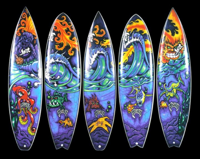
To each their own, I think surfing has more punk inspired, skateboard/ line afterbang type graphics which can be cool if done right but I also agree can look kind of cluttered if not.
cydwhitYa'll asked for more detailed feedback. I gave it. The views expressed in my post are those of one industry-adjacent weirdo drawing Dungeons and Dragons crap in the spare bedroom.
I've gushed over your good graphics plenty, showed them to my friends, written literally thousands of words about how much I liked riding some of your skis. But I want to have a conversation about what this community thinks about this year's crop of graphics, from a bunch of brands.
I didn't say the problem is that you're not doing the same as everyone else, I said the problem is that you're doing something different in a way that occasionally comes off as low quality and tacky. This is the graphic discussion thread, not the "suck up to the industry" thread.
Cy, I was offline since Fri camping or would have hit your reply back sooner. I totally hear ya! and of course appreciate all the KIND words and support you also said. I was just too quick on the keyboard Fri and shouldn't have only focused on the few bits of negative. I've designed enough skis to know you don't have good graphics unless some people love and... others hate them haha. You put in some real deep thought and time into your response and keeping this thread going so thanks for that and I sorry I forgot to say so in my first response. You know I've been in these threads for 17 years so never would expect a suck up thread from NS haha. All good
Quick question on the "Hotshot" we just added this model and super curious which graphic direction you'd prefer for a ski that's 106 waist, intended for charging hard, shaped to surf pow, but still hold it's own on groomed.
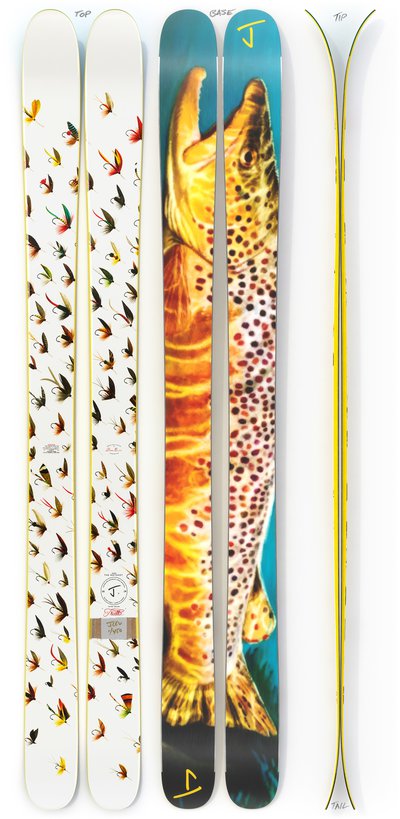
We almost scrapped this "Trutta" fish design thinking it was too niche, but sooo many have asked for trout art over the years and working with Dan Burr, the artist in the vid was too good a fit so we went with it.
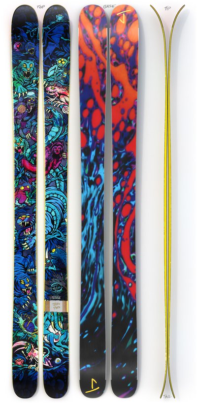
However on the totally other side of graphic vibe spectrum (same ski) with "Noctornal Daydream" graphic by legend Ryan Schmies, OG creator of the Public Enemy and Seth graphics, wondering... vs the trout which speaks to YOU more?
You know where I stand on this, but I do agree with the person who said he didnt like the yellow sidewall on everything. There are some skis yellow sidewall, just doesnt really fit with and if you were able to introduce more variety in sidewall colors it might make some of the graphics work a lot better. This year, the moon dogs design on the friend I feel would benefit from a black sidewall..
JLevQuick question on the "Hotshot" we just added this model and super curious which graphic direction you'd prefer for a ski that's 106 waist, intended for charging hard, shaped to surf pow, but still hold it's own on groomed.
We almost scrapped this "Trutta" fish design thinking it was too niche, but sooo many have asked for trout art over the years and working with Dan Burr, the artist in the vid was too good a fit so we went with it.
However on the totally other side of graphic vibe spectrum (same ski) with "Noctornal Daydream" graphic by legend Ryan Schmies, OG creator of the Public Enemy and Seth graphics, wondering... vs the trout which speaks to YOU more?