It looks like you are using an ad blocker. That's okay. Who doesn't? But without advertising revenue, we can't keep making this site awesome. Click the link below for instructions on disabling adblock.
Welcome to the Newschoolers forums! You may read the forums as a guest, however you must be a registered member to post.
Register to become a member today!
This is a thing I think about and want to talk about way too much, so I figured it deserved its own thread. What graphics are you stoked on, who do you think phoned it in, what graphics do you not love personally but understand why they look like that? One thread for all of next winter's skis.
Disclaimer: All of this nonsense comes from me, a guy who wants to draw ski graphics someday, and is really interested in the art and design adjacent to skiing. And I think I can learn from a conversation in this community about what graphics are making folks stoked and what aren't, so I'm intrigued to hear everyone's takes.
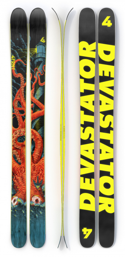
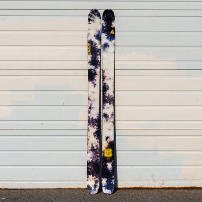
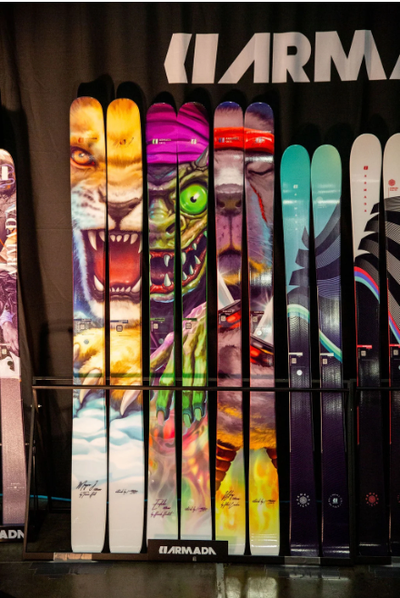
New 4frnt Devastator is my favorite thing they've done in ages:
Like, that graphic is going to be hard to beat this year IMO. Will look great on the wall, or the snow.
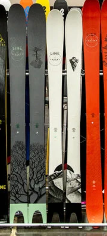
MSP line makes a ton of sense for me, well done coming up with something cool and cohesive that won't turn off anyone buying that type of ski. And I love that they all line up next to each other. Clever stuff.
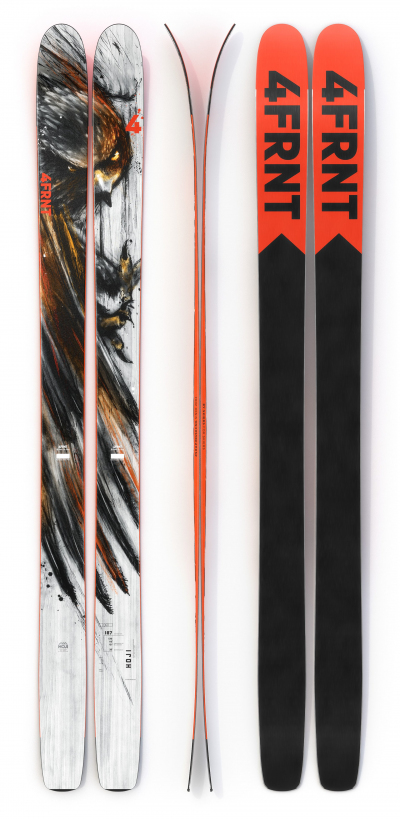
I personally really don't dig the style of any of the Hoji series, but I understand if you do. I miss the clean simple wood looking hojis, and also the old style Hojis. These new ones feel like they'd obnoxious without being cool, but I'm open to arguments there.
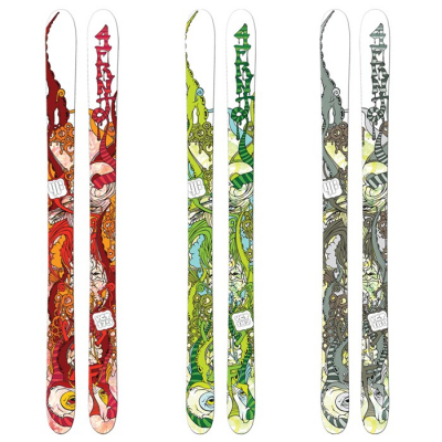
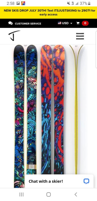
Really bummed on the new J line. Jimbo and Schmies graphics deliver just as well as you'd hope, and the Slacker with the skinny ski graphic is clever, but otherwise I'm not really that blown away by any of the others. Fight me?
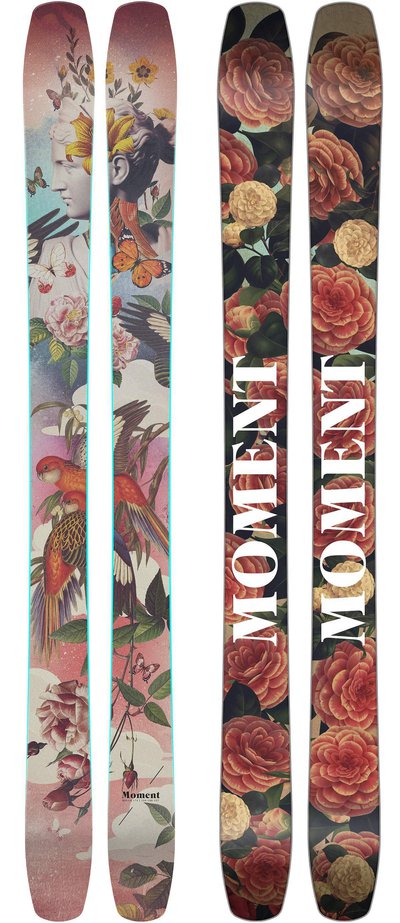
Moment did Moment things again. I think the Commander line is the most on-brand thing they could ever do. Love the lava skis, love the lady skis, not convinced by the DW tour, but it may be way cooler IRL. I think Moment's more understated graphics, like this and last year's DW tours actually shine way harder in person. I love the moon graphic. And no Frankenski will ever be as beautiful as last year's, but there's no helping that.
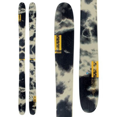
Rossi Black Ops line all looks like Inthaynes to me, also, sorta like those K2's also, all generic, but that's also sort of the point I guess? Whatever, didn't expect better of them.
K2's look like K2s. Almost cool? Almost retro? Idk, Reconners leave a lot to be desired compared to Pettitors or Hellbents, but I get that they're aiming everything at a different demographic.
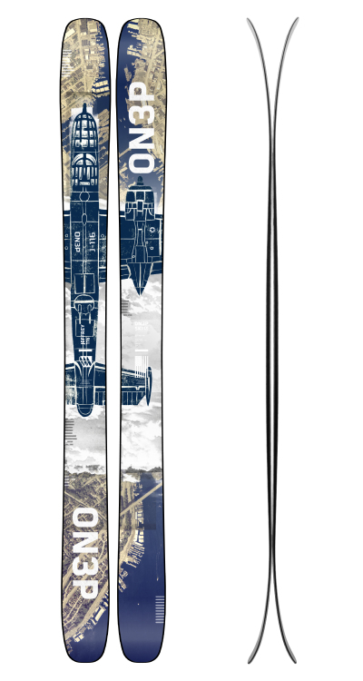
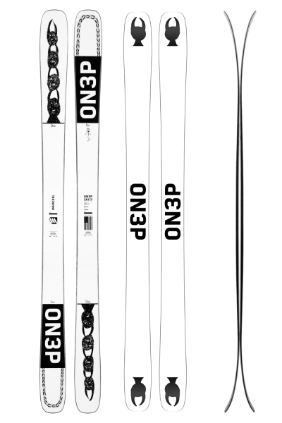
ON3P's look great as always. Cool to see them stay so on-brand for so long, while still coming up with fresh stuff. Customs are all slick as well.
So, what did I miss? Where am I wrong? Why should I quit drawing?
Moment went in on the Wildcat graphics 100%
ON3P is really keeping things interesting I appreciate that!
Volkl went reaaalllly goofy with the cubist looking animals. Good for them for changing things up I guess.
Vishnu again coming through with the food photography.
Skevik always has some pretty cool art on their skis. I like the Van Loon graphic.
I really love looking at graphics but it's honestly the last thing I consider when purchasing skis.
**This post was edited on Aug 5th 2020 at 4:00:08pm
cydwhitReally bummed on the new J line. Jimbo and Schmies graphics deliver just as well as you'd hope, and the Slacker with the skinny ski graphic is clever, but otherwise I'm not really that blown away by any of the others. Fight me?
Ha, can't win 'em all Cy!
Would love to get some more concrete feedback on what you're digging / not digging aside from just being really bummed. Obviously can't please everyone and we've actually been kinda surprised with which skis are selling well so far, but as an industry/art guy your perspective is always valued.
**This post was edited on Aug 5th 2020 at 4:34:55pm
SuspiciousFishThe new Devastator Graphics look like they were inspired by the old 2009 VCTs.
Somebody I follow had a SUPER similar style to this, or maybe it's the same artist. I'm driving myself crazy right now because I can't remember where I've seen it before, might be on an old DMB or Black Keys poster. It's that textural, limited palette Kraken imagery that I love and can't remember where I've seen it before.....
But yeah, nice catch on the throwback. I'll agree to disagree with ya on the Hoji, I can't articulate why I don't like it, so I can't really argue it haha!
Would love to get some more concrete feedback on what you're digging / not digging aside from just being really bummed. Obviously can't please everyone and we've actually been kinda surprised with which skis are selling well so far, but as an industry/art guy your perspective is always valued.
**This post was edited on Aug 5th 2020 at 4:34:55pm
Ha. I was worried somebody actually in the industry would read this!
Disclaimer, I think you've released some of the prettiest skis on the market too, and I've really enjoyed riding a bunch of 'em, but here's how this current lineup makes me feel. And it's not related to what I think would sell or whatever, just on aesthetics.
Obviously this is subjective and different stokes for different folks, but here's a more articulated take, and I guess I won't pull any punches, 'cause it's the internet haha:
1) I get it that part of J is not having a cohesive look for the brand, there's a zillion different graphics with something for almost everyone, and all they have in common is who is making the skis. But I would almost argue that there is starting to be a cohesive look for "J Skis" and it's hastily done, low-quality graphics. Yes, there are a bunch of exceptions, but my friend group, and myself have all seen J's in the wild, not known who made them, but gone "that looks like somebody photoshopped some random crap on a ski, it's probably a J." Does that make sense? If I see a bunch of random crap on a ski, that doesn't necessarily look "crafted", I can assume pretty accurately who made it.
2) So many of these graphics don't look like they were made by skiers for skiers. I LOVE that you're doing artist collabs. But a bunch of those artists don't seem to have much experience working at the weird aspect ratio that skis have. So it looks like you're just taking their art and figuring out a crop that works on skis. Which adds to the "photoshopped" vibe. Again, stoked you're working with a bunch of artists, and I think they do great work. But much of it doesn't look like it's meant to go on a topsheet or a base. And that's a bummer. And yes, pot calling the kettle black, I'm not claiming to be a better artist or designer, just speaking from my seat as a critic/customer.
3) Graphics don't affect how a ski rides. They don't matter. And if you've got somebody out there who just wants a washed-out tie-die graphic with some peace signs, cool for them. But I don't think I'm alone in saying that great ski graphics are more than just art on a topsheet. They carry the legacy of a ski and a time in skiing on them. And yes, maybe skiing is moving away from that, maybe cool topsheets are going the way of full-length ski films. But man, every time I see a Pollard tree graphic out in the wild, it makes me nostalgic for a special time in skiing. I see a Hellbent at a yardsale and I remember the Pettit poster on my wall growing up. Hell, even old Salomo Czars, or Afterbangs, or whatever, they carry more weight than just the ski or just the graphic? Make sense?
And, harking back to point #1, good graphics tell me what brand made the ski. I don't have an encyclopedic knowledge of every Moment graphic out there, but I instantly recognize old Moments on the hill. Same goes for ON3P and Line, and a bunch of other brands. It's not because of the branding, it's because it's a ski that obviously came from the same visual family.
It feels like so many of the graphics I see on your site right now were designed to sell a few skis fast, and then not really be thought about ever again. Which is fine. But also makes me sad.
So yeah, stoked the brand exists, keep doing what you're doing. I love to talk ski graphics, and hear what other people like, and discuss why we don't like some stuff. So there ya go.
cydwhitSomebody I follow had a SUPER similar style to this, or maybe it's the same artist. I'm driving myself crazy right now because I can't remember where I've seen it before, might be on an old DMB or Black Keys poster. It's that textural, limited palette Kraken imagery that I love and can't remember where I've seen it before.....
But yeah, nice catch on the throwback. I'll agree to disagree with ya on the Hoji, I can't articulate why I don't like it, so I can't really argue it haha!
I can see where you are coming from on the Hoji. Usually topsheets look best when there is not really single focal point on the ski which can be distracting instead of the whole ski looking cool in itself. A lot of the weight of the design is on the left ski too which causes some balance issues. That being said, it has a certain intensity to it which I cant shake. It kind of captures that laser sharp focus you need skiing big lines.
Always love seeing feedback on the graphics. Speaking for K2's graphic team, I'm kinda into your feedback of Almost Cool? Almost Retro? Im going to take that as a compliment!
It's all good in my book. The industry as a whole really delivered this year in my opinion! Each brand has their own place, each should look different (as much as we can besides our Inthayne/Poacher dilemma) and keep us all moving forward.
Not trying to stoke everyone out too much but we already have 21/22 graphics in the bag. We took some feedback, we kept having fun, and we are proud of where we are moving K2 in the future. Just don't try to come and hack my computer to see them :)
If anyone has any more questions on K2's graphic story for this coming year please let me know! It was my first season working for them and we had some fun with the line while getting our gears moving. I'll never be able to live up to the magic that Schmies created but I'm going to do my damn best to try and make something new over here at K2 in the years to come! Cheers everyone!
ON3P's jeffrey. Bomber ass graphics for the most bomber skis in the game. Shit's amazing. really makes me wanna spend way more than I can afford on a pair of sticks. But then there's the hackel pro model. Kinda looks like the in-school-suspension desk in a middle school. Not sure which mark this one hit. I legitimately feel on3p released one of the raddest and one of the wackest topsheets this szn.
Kind of related to ski graphics, but the only thing I'm disappointing thing about the Moment ski graphics is the bases. With the bibbys they continued the artwork onto the bases but now they just have Moment on the tip and tail, it would be sick if they brought this back with the wildcats. They might have already mentioned why they stopped this i haven't check just my thoughts though.
bradwaltersAlways love seeing feedback on the graphics. Speaking for K2's graphic team, I'm kinda into your feedback of Almost Cool? Almost Retro? Im going to take that as a compliment!
It's all good in my book. The industry as a whole really delivered this year in my opinion! Each brand has their own place, each should look different (as much as we can besides our Inthayne/Poacher dilemma) and keep us all moving forward.
Not trying to stoke everyone out too much but we already have 21/22 graphics in the bag. We took some feedback, we kept having fun, and we are proud of where we are moving K2 in the future. Just don't try to come and hack my computer to see them :)
If anyone has any more questions on K2's graphic story for this coming year please let me know! It was my first season working for them and we had some fun with the line while getting our gears moving. I'll never be able to live up to the magic that Schmies created but I'm going to do my damn best to try and make something new over here at K2 in the years to come! Cheers everyone!
Ha, yeah, I should have been more clear, totally a compliment. Seems like you have to walk a tight line given how many skis you're selling, so I'm pretty stoked on 'em. Also, Reconners are way cleaner in person than on the internet, so I'm pretty stoked on that!
I suck at multi-quoting so I'mma respond to all ya'll.
I get the Hackle frustration, but also, isn't that sort of the point of pro models? To articulate the artistic vision of the skier in a physical form? So, like if that's what he's down with, and ON3P is down with him, that's sorta how the cookie crumbles IMO. Also, more skis should have a "draw here" zone and come with paint pens.
Here's my plea to the industry: Give me the opportunity to do topsheet art and I'll come up with some sort of insane paint by numbers graphic that makes people really stoked on the brand. Seriously. I have ideas, this would be really neat!
HamezKind of related to ski graphics, but the only thing I'm disappointing thing about the Moment ski graphics is the bases. With the bibbys they continued the artwork onto the bases but now they just have Moment on the tip and tail, it would be sick if they brought this back with the wildcats. They might have already mentioned why they stopped this i haven't check just my thoughts though.
Yeah, I know, I love printed bases too, but I totally understand why companies just do die-cut bases, and as long as there's some sort of color pop on the base to make them photogenic I'm not gonna complain.
cydwhitHa, yeah, I should have been more clear, totally a compliment. Seems like you have to walk a tight line given how many skis you're selling, so I'm pretty stoked on 'em. Also, Reconners are way cleaner in person than on the internet, so I'm pretty stoked on that!
That's great to hear! I'm stoked you liked what you saw in person. Give 'em a ski if you get a chance. The engineers made a damn good ski, my job was the easy part.
bradwaltersAlways love seeing feedback on the graphics. Speaking for K2's graphic team, I'm kinda into your feedback of Almost Cool? Almost Retro? Im going to take that as a compliment!
It's all good in my book. The industry as a whole really delivered this year in my opinion! Each brand has their own place, each should look different (as much as we can besides our Inthayne/Poacher dilemma) and keep us all moving forward.
Not trying to stoke everyone out too much but we already have 21/22 graphics in the bag. We took some feedback, we kept having fun, and we are proud of where we are moving K2 in the future. Just don't try to come and hack my computer to see them :)
If anyone has any more questions on K2's graphic story for this coming year please let me know! It was my first season working for them and we had some fun with the line while getting our gears moving. I'll never be able to live up to the magic that Schmies created but I'm going to do my damn best to try and make something new over here at K2 in the years to come! Cheers everyone!
BiffbarfON3P's jeffrey. Bomber ass graphics for the most bomber skis in the game. Shit's amazing. really makes me wanna spend way more than I can afford on a pair of sticks. But then there's the hackel pro model. Kinda looks like the in-school-suspension desk in a middle school. Not sure which mark this one hit. I legitimately feel on3p released one of the raddest and one of the wackest topsheets this szn.
Gotta agree to disagree on this one. I like the the hacker cause it’s simple and clean. The Jeffery is a little too busy this year. Although the Mango sunrise is straight fucking fire, I love it and I’ve heard it looks even better in person.
cydwhitHa. I was worried somebody actually in the industry would read this!
Disclaimer, I think you've released some of the prettiest skis on the market too, and I've really enjoyed riding a bunch of 'em, but here's how this current lineup makes me feel. And it's not related to what I think would sell or whatever, just on aesthetics.
Obviously this is subjective and different stokes for different folks, but here's a more articulated take, and I guess I won't pull any punches, 'cause it's the internet haha:
1) I get it that part of J is not having a cohesive look for the brand, there's a zillion different graphics with something for almost everyone, and all they have in common is who is making the skis. But I would almost argue that there is starting to be a cohesive look for "J Skis" and it's hastily done, low-quality graphics. Yes, there are a bunch of exceptions, but my friend group, and myself have all seen J's in the wild, not known who made them, but gone "that looks like somebody photoshopped some random crap on a ski, it's probably a J." Does that make sense? If I see a bunch of random crap on a ski, that doesn't necessarily look "crafted", I can assume pretty accurately who made it.
2) So many of these graphics don't look like they were made by skiers for skiers. I LOVE that you're doing artist collabs. But a bunch of those artists don't seem to have much experience working at the weird aspect ratio that skis have. So it looks like you're just taking their art and figuring out a crop that works on skis. Which adds to the "photoshopped" vibe. Again, stoked you're working with a bunch of artists, and I think they do great work. But much of it doesn't look like it's meant to go on a topsheet or a base. And that's a bummer. And yes, pot calling the kettle black, I'm not claiming to be a better artist or designer, just speaking from my seat as a critic/customer.
3) c And if you've got somebody out there who just wants a washed-out tie-die graphic with some peace signs, cool for them. But I don't think I'm alone in saying that great ski graphics are more than just art on a topsheet. They carry the legacy of a ski and a time in skiing on them. And yes, maybe skiing is moving away from that, maybe cool topsheets are going the way of full-length ski films. But man, every time I see a Pollard tree graphic out in the wild, it makes me nostalgic for a special time in skiing. I see a Hellbent at a yardsale and I remember the Pettit poster on my wall growing up. Hell, even old Salomo Czars, or Afterbangs, or whatever, they carry more weight than just the ski or just the graphic? Make sense?
And, harking back to point #1, good graphics tell me what brand made the ski. I don't have an encyclopedic knowledge of every Moment graphic out there, but I instantly recognize old Moments on the hill. Same goes for ON3P and Line, and a bunch of other brands. It's not because of the branding, it's because it's a ski that obviously came from the same visual family.
It feels like so many of the graphics I see on your site right now were designed to sell a few skis fast, and then not really be thought about ever again. Which is fine. But also makes me sad.
So yeah, stoked the brand exists, keep doing what you're doing. I love to talk ski graphics, and hear what other people like, and discuss why we don't like some stuff. So there ya go.
Really Cy? I should be doing the same as every other ski company? Never have, never will.
Coming from an artist I would think you would be pointing out the insane amount of time and effort that is put into these graphics because you would know better than anyone, that creating as you say the prettiest graphics on the weirdest aspect ratio is not easy, not quick, and takes a ton of effort by lots of very talented skiers, artists, engineers and more throughout the entire 7 month process from concept to what you clicked a link on to see today.
**This post was edited on Aug 9th 2020 at 7:08:50pm
CatdickBojanglesGotta agree to disagree on this one. I like the the hacker cause it’s simple and clean. The Jeffery is a little too busy this year. Although the Mango sunrise is straight fucking fire, I love it and I’ve heard it looks even better in person.
That's totally fair, I tend to like more busy graphics. Funny you say that about the mango sunrise, I think es aight, but man I bet this year's magnus's will fuckin pop on the snow like no other ski
bradwaltersThat's great to hear! I'm stoked you liked what you saw in person. Give 'em a ski if you get a chance. The engineers made a damn good ski, my job was the easy part.
I was supposed to spend the spring on 'em before...ya know....Can't wait. Really excited about those skis.
JLevReally Cy? I should be doing the same as every other ski company? Never have, never will.
Coming from an artist, I would think you would be pointing out the insane amount of time and effort that is put into these graphics because you would know better than anyone, that creating as you say the prettiest graphics on the weirdest aspect ratio is not easy, not quick, and takes a ton of effort by lots of very talented skiers, artists, engineers and more throughout the entire 7 month process from concept to what you clicked a link on to see today.
Ya'll asked for more detailed feedback. I gave it. The views expressed in my post are those of one industry-adjacent weirdo drawing Dungeons and Dragons crap in the spare bedroom.
I've gushed over your good graphics plenty, showed them to my friends, written literally thousands of words about how much I liked riding some of your skis. But I want to have a conversation about what this community thinks about this year's crop of graphics, from a bunch of brands.
I didn't say the problem is that you're not doing the same as everyone else, I said the problem is that you're doing something different in a way that occasionally comes off as low quality and tacky. This is the graphic discussion thread, not the "suck up to the industry" thread.
skiP.E.I.Moment went in on the Wildcat graphics 100%
ON3P is really keeping things interesting I appreciate that!
Volkl went reaaalllly goofy with the cubist looking animals. Good for them for changing things up I guess.
Vishnu again coming through with the food photography.
Skevik always has some pretty cool art on their skis. I like the Van Loon graphic.
I really love looking at graphics but it's honestly the last thing I consider when purchasing skis.
**This post was edited on Aug 5th 2020 at 4:00:08pm
Yeah, I'm really glad Volkl tried something new with those animals. Personally I think a different color palette on the same design would have made those skis look way better, but I get what's going on there.
I used to HAAAATE the Vishnu photo graphics. And I'm still sorta bummed, but I've grown to accept them, and sorta understand what they're doing there haha. That one Wet 100% looks like an ad for a hard seltzer though haha.
I think Skevik has been low key killing the ski art game for a while. They're so cool, rode the lift with a couple who had them last year and couldn't stop staring the whole ride.
BiffbarfON3P's jeffrey. Bomber ass graphics for the most bomber skis in the game. Shit's amazing. really makes me wanna spend way more than I can afford on a pair of sticks. But then there's the hackel pro model. Kinda looks like the in-school-suspension desk in a middle school. Not sure which mark this one hit. I legitimately feel on3p released one of the raddest and one of the wackest topsheets this szn.
Glad to see ON3P taking risks again with graphics this year. Last years looked good but where also somewhat generic/safe. Jeffery with the satellite street grid in the background looks sick.
cydwhitReally bummed on the new J line. Jimbo and Schmies graphics deliver just as well as you'd hope, and the Slacker with the skinny ski graphic is clever, but otherwise I'm not really that blown away by any of the others. Fight me?
J Skis graphics definitely seem to be hit or miss (imo), but one thing that really turns me off them is the yellow sidewall. I guess it's the same yellow as their logo and it makes the skis stand out a bit in the lift line, but it definitely clashes with some of their designs and really dissuades me from buying a pair whenever I'm looking for new skis.
pinkcamo1000one thing I think more ski companies need to consider is how a ski looks from far away. I need people on the chair to think my skis look sick
skiP.E.I.Moment went in on the Wildcat graphics 100%
ON3P is really keeping things interesting I appreciate that!
Volkl went reaaalllly goofy with the cubist looking animals. Good for them for changing things up I guess.
Vishnu again coming through with the food photography.
Skevik always has some pretty cool art on their skis. I like the Van Loon graphic.
I really love looking at graphics but it's honestly the last thing I consider when purchasing skis.
**This post was edited on Aug 5th 2020 at 4:00:08pm
As an ON3P guy, I actually love the Volkl graphics from last year's revolt 121 and this years 121 and 104. Reminds me of Picasso like you said
r00kieGlad to see ON3P taking risks again with graphics this year. Last years looked good but where also somewhat generic/safe. Jeffery with the satellite street grid in the background looks sick.
Agreed here ON3P graphics were solid last year but felt like they didn't take risks. Think they really one upped themselves this year so far
Bombers look superb, hackels arent my taste but I think we can all agree on the mango sunrises
BiffbarfON3P's jeffrey. Bomber ass graphics for the most bomber skis in the game. Shit's amazing. really makes me wanna spend way more than I can afford on a pair of sticks. But then there's the hackel pro model. Kinda looks like the in-school-suspension desk in a middle school. Not sure which mark this one hit. I legitimately feel on3p released one of the raddest and one of the wackest topsheets this szn.
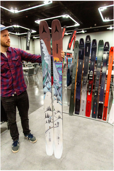
Not a big fan of Armada's signature series this year, kinda too realistic and zoomed in for me. That being said, I think the Whitewalkers look fantastic
I agree with this post wholeheartedly, love last year's graphics, this year they're just a bit too odd looking from close up in my mind. White Walker looks sick though
highpeak
Not a big fan of Armada's signature series this year, kinda too realistic and zoomed in for me. That being said, I think the Whitewalkers look fantastic
Some of my fav graphics this year that haven't been mentioned already. New prodigy line is simple, clean, yet still pops. Bentchetlers are a work of art per usual. Sakanas and Pescados give off the timeless vibe of Pollard's old Sir Francis Bacon and Magnum Opus.
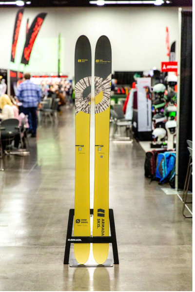
Y'all should be stoked because the good people at 4FRNT and K2 basically tag teamed the best looking skis of the season and gave you an all mtn/pow ripper and a park ripper :)
We all win on this one
4FRNTwho wore it better?
**This post was edited on Aug 6th 2020 at 12:30:43pm
bradwaltersY'all should be stoked because the good people at 4FRNT and K2 basically tag teamed the best looking skis of the season and gave you an all mtn/pow ripper and a park ripper :)
We all win on this one
Haha take your new favorite graphic anywhere you want, park or pow!
Not a big fan of Armada's signature series this year, kinda too realistic and zoomed in for me. That being said, I think the Whitewalkers look fantastic
Dude! I meant to mention these, but then J drama derailed me. Holy crap! These are wild. My guess is that three people are going to love them and defend them with an aggresive intensity. To me they look like the worst combo of gas station/fantasy/airbrush art I've seen in a while. But I think most of my problem is actually with the color grade? Like I can imagine a slightly more muted, or maybe with a different hue or something version of these that is tolerable. But man, something about em makes me sad.
That said, Armada's Zero series has been really cool since they came out, and I think the new Whitewalker is the best yet. It's such a good fit for the whole marketing story around that line of skis.
Lots of good stuff in this thread, especially Commanders, Wildcats, Jefferies, and Devastators. My favorite graphics would have to be the new Moment Bellas though, if I were a girl I’d be scooping those up so fast.
highpeakSome of my fav graphics this year that haven't been mentioned already. New prodigy line is simple, clean, yet still pops. Bentchetlers are a work of art per usual. Sakanas and Pescados give off the timeless vibe of Pollard's old Sir Francis Bacon and Magnum Opus.
Yes! Pescados throw me all the way back, while still being fresh and new. Love 'em. And I think the Chetler gets better every year. Big fan.
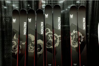
I feel like I never love or hate Factions. They're usually clean, and just cool enough for my taste.
bradwaltersY'all should be stoked because the good people at 4FRNT and K2 basically tag teamed the best looking skis of the season and gave you an all mtn/pow ripper and a park ripper :)
We all win on this one
This. And I think both skis look great, and not thaaat similar.
That said, it reminds me of this graphic overlap:
I loved this graphic, but I realized the trees at the top were from a stock photo, I had a facemask from a different brand with the same stock photo on it, and I think a third brand was also using the same photo as a header at the same time. I couldn't escape that freaking treeline that winter.
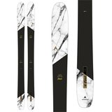
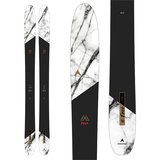
Rad thread idea Cy. While everyone may not share the same view as me because art is indeed up to the viewer and not valued based on the amount of time spent, I am a fan of Dynastar's M-Free line graphics.
Yes I am sponsored by them, but I am genuinely excited about the new graphics and this new 108. While I'm not usually wild about multiple models sharing the same graphic, imo it's a very clean graphic and helps with this bigger brands cohesive M-Free branding helping get the word out on the new sticks. It's a huge departure from the single race graphic that spanned their whole ski line just a couple years ago.
New ON3P Jeffrey is very sick especially because they are continuing the Wartime/Industrial story that was on the older Jeffreys.
I dig WNDR alpine's graphics as I think it lines up well with the brand as futuristic eco manufacturers concerned with making a good ski.
I think it's rad Volkl went with the animals on the revolts. They almost mad me think Madsteeze but not nearly enough purple to draw any sort of parallels.
Always have a soft spot for Pollard graphics. So thoughtful yet wonderfully simplistic.
Last but not least. 2021 Armada B Dogs and last years are real sick. Who doesn't love dogs, especially when they assume the alter ego of our lord and steeze savior, B-Dog.
Once again, art is in the eye of the beholder. Guaranteed a graphic that is liked by some will be hated by others. I like how much different stuff there is going on in the ski graphic world. Keep it up everyone!
First off...stoked you're as into everyone's graphics as you are. Nice to know they're at least stirring up some emotion regardless of whether you like them. All art is so subjective it's impossible to make everyone happy all the time, but if it started a conversation, it can't be a bad thing. I noticed no one has mentioned DPS in here (though I do love the aesthetic of their skis).
That said, I figured I'd give a bit of context that might help frame where J is coming from.
1) THE SHAPERS VIBE... When J first started the company he said he wanted to approach graphics from a different perspective than we'd ever done before. Obviously his background in the industry speaks for itself when it comes to producing badass, memorable ski graphics so if he wanted to build more like he had in the past he could. But he chose to try something new. The original idea was to downplay "J" branding all together and treat the brand like a shaper's signature on a surfboard. The goal was to let the artists original vibe show through without the ski shape being overly constricting. That was/is intentional. It's also the reason the "J" logo is basically just his signature and not some big stylized Futura Bold or something and shown prominently in the forefoot and huge on the base. (You'll notice there is no branding forefoot of the topsheet). J's trying something a bit different.
2) QUALITY... I DO take issue with your saying the graphics are 'hastily done, low quality'. We've worked with some pretty badass artists that literally have built their lives around their art so to call it low quality is a pretty cheap shot. I think David Hale, Paul Jackson, Ryan Schmies, Adam Haynes, Jimbo Phillips, L'Amour Supreme, Chris Delorenzo, Tetsuya Abe, Mike Yoshida, Colton Jacobs, David Pirrie, Conrad Godly, Elyse Dodge, Liam Ashurst, Samm Moore, Zoe Keller, etc would all take issue with that. Shit..even Sam Zahner, Giray, Level1, Inspired, Ski the East, etc would probably take issue considering we worked side by side on those graphics, so the 'not by skiers' comment feels a little baseless too. Just sayin'.
3) LIMITED EDITIONS... As for the layout...that is my bad if you don't like how it was laid out on the ski. I'll take full responsibility on that one. But honestly I love the fact that many of our artists are outside of the ski bubble. If we limited the potential art to only people that skied then that would defeat J's original vision of this brand. Sometimes the art/artist works better with the limited canvas and sometimes it's a struggle but our goal is to keep their art as true to their vibe as possible. It's also the main reason we build multiple graphics in each model and why they are limited editions. If you're not into one artist or the way it was laid out, then maybe you got a back up. Nike doesn't just make one Dunk.
Hopefully that explains a bit of the 'why'. The nostalgia comment I can't really respond to because that is even more subjective than art and brings in a lot context.
But the fact that J's don't look like they are from a family is sorta the point. J wasn't set up to operate the same way as brands we all came from did. J doesn't have big paid pros, tons of exposure in films, huge marketing budgets to support events, the inside spread in every mag, big branding in the forefoot and tail and base, etc. J is a small scrappy company trying to build some cool new shit to enhance everyone's standup sledding.
And just to be clear...none of this is trying to convince you to like something different. You're still not going to like what you don't like. I just wanted to explain some of the thinking behind it as well as stand up for the badass artists whose work we love and feel super fortunate to work with. And there are SO many good graphics from a ton of other companies like Moment (shout out to Luke), Line, etc. we all got options. And at the end of the day, as J says "It's just skiing".
I DO have to say thanks for starting this thread and posting those Devs at the top. Love those things!
Cheers.
Fank
cydwhitHa. I was worried somebody actually in the industry would read this!
Disclaimer, I think you've released some of the prettiest skis on the market too, and I've really enjoyed riding a bunch of 'em, but here's how this current lineup makes me feel. And it's not related to what I think would sell or whatever, just on aesthetics.
Obviously this is subjective and different stokes for different folks, but here's a more articulated take, and I guess I won't pull any punches, 'cause it's the internet haha:
1) I get it that part of J is not having a cohesive look for the brand, there's a zillion different graphics with something for almost everyone, and all they have in common is who is making the skis. But I would almost argue that there is starting to be a cohesive look for "J Skis" and it's hastily done, low-quality graphics. Yes, there are a bunch of exceptions, but my friend group, and myself have all seen J's in the wild, not known who made them, but gone "that looks like somebody photoshopped some random crap on a ski, it's probably a J." Does that make sense? If I see a bunch of random crap on a ski, that doesn't necessarily look "crafted", I can assume pretty accurately who made it.
2) So many of these graphics don't look like they were made by skiers for skiers. I LOVE that you're doing artist collabs. But a bunch of those artists don't seem to have much experience working at the weird aspect ratio that skis have. So it looks like you're just taking their art and figuring out a crop that works on skis. Which adds to the "photoshopped" vibe. Again, stoked you're working with a bunch of artists, and I think they do great work. But much of it doesn't look like it's meant to go on a topsheet or a base. And that's a bummer. And yes, pot calling the kettle black, I'm not claiming to be a better artist or designer, just speaking from my seat as a critic/customer.
3) Graphics don't affect how a ski rides. They don't matter. And if you've got somebody out there who just wants a washed-out tie-die graphic with some peace signs, cool for them. But I don't think I'm alone in saying that great ski graphics are more than just art on a topsheet. They carry the legacy of a ski and a time in skiing on them. And yes, maybe skiing is moving away from that, maybe cool topsheets are going the way of full-length ski films. But man, every time I see a Pollard tree graphic out in the wild, it makes me nostalgic for a special time in skiing. I see a Hellbent at a yardsale and I remember the Pettit poster on my wall growing up. Hell, even old Salomo Czars, or Afterbangs, or whatever, they carry more weight than just the ski or just the graphic? Make sense?
And, harking back to point #1, good graphics tell me what brand made the ski. I don't have an encyclopedic knowledge of every Moment graphic out there, but I instantly recognize old Moments on the hill. Same goes for ON3P and Line, and a bunch of other brands. It's not because of the branding, it's because it's a ski that obviously came from the same visual family.
It feels like so many of the graphics I see on your site right now were designed to sell a few skis fast, and then not really be thought about ever again. Which is fine. But also makes me sad.
So yeah, stoked the brand exists, keep doing what you're doing. I love to talk ski graphics, and hear what other people like, and discuss why we don't like some stuff. So there ya go.
sander_hRad thread idea Cy. While everyone may not share the same view as me because art is indeed up to the viewer and not valued based on the amount of time spent, I am a fan of Dynastar's M-Free line graphics.
Always been a fan of marbling whether that's in a graphic or a steak. The touch of gold is great too.
sander_hRad thread idea Cy. While everyone may not share the same view as me because art is indeed up to the viewer and not valued based on the amount of time spent, I am a fan of Dynastar's M-Free line graphics.
Yes I am sponsored by them, but I am genuinely excited about the new graphics and this new 108. While I'm not usually wild about multiple models sharing the same graphic, imo it's a very clean graphic and helps with this bigger brands cohesive M-Free branding helping get the word out on the new sticks. It's a huge departure from the single race graphic that spanned their whole ski line just a couple years ago.
New ON3P Jeffrey is very sick especially because they are continuing the Wartime/Industrial story that was on the older Jeffreys.
I dig WNDR alpine's graphics as I think it lines up well with the brand as futuristic eco manufacturers concerned with making a good ski.
I think it's rad Volkl went with the animals on the revolts. They almost mad me think Madsteeze but not nearly enough purple to draw any sort of parallels.
Always have a soft spot for Pollard graphics. So thoughtful yet wonderfully simplistic.
Last but not least. 2021 Armada B Dogs and last years are real sick. Who doesn't love dogs, especially when they assume the alter ego of our lord and steeze savior, B-Dog.
Once again, art is in the eye of the beholder. Guaranteed a graphic that is liked by some will be hated by others. I like how much different stuff there is going on in the ski graphic world. Keep it up everyone!
Someone give Cy a shot, you won't be mad.
Saw a pair of these last year in person mounted with the new gold pivots and I must say it is the perfect combo. Looked like a lambo.
Yeah. I mean, I didn't intend to start a "let's fight over J's graphics thread, but I guess that's what we're turning into here.
I'm not arguing about the artist list. Most of those names are people I've been following for years and really respect. And I'm not saying their art is hastily done. And, as someone who (spoiler alert) is also building my life around art, I'm not trying to take cheap shots at them. I'm saying that I'm not stoked on how a lot of that art translates to skis. If you are stoked on that, sick.
I'm not judging anyone's graphic line on process. I'm throwing out opinions on the final product because that's what the consumer gets. If it needs a bunch of explaining doesn't that sorta defeat the point?
I understand the "why" of J Skis. I get it. And I'm saying that a large portion of this year's "what" of J doesn't resonate with me. While also trying to start a bigger conversation about ski graphics in general. I'd love it if there was a juried awards show for ski graphics every year. That's what I'm into. This is what I spend my free time thinking about. Skiing needs a Tom and Lorenzo and I'm trying in a small way to push it in that sort of critical direction.
Full disclosure so everyone has all the context: I have done one ski graphic ever. Some people like it, some don't. Personally, I hate it now. It wasn't a great use of that canvas, it doesn't hold up, and I'm not stoked on it. I am not affiliated with any ski brand. I don't have secret ties to anyone. I have an orange name because I can't quit making art and writing words on the fringes of this sport.
cydwhitI feel like I never love or hate Factions. They're usually clean, and just cool enough for my taste.
Talk about giving the skier a canvas for their own art! And while I'm referencing the Hackel graphic, as soon as I saw those I knew some would love them and some would hate them.
I think it's pretty special for a pro model to have a graphic that comes from the athlete's own brain/ hand. Drawing and skiing are pretty closely related in terms of flow and a thought or impulse from your brain being applied in space.
What makes the concept for those graphics even more cool is the invitation for the skier's own art being combined with Hackel's on the ski, implying that the skier will take ski inspiration from Hackel while adding their own interpretation on snow.
Don't know if this makes sense but those are my thoughts.
Basically if you think the athlete's skiing is inspirational, it's worth having a thought about their art too, since it's coming from a similar intellectual place.