A quick word on blocking ads

It looks like you are using an ad blocker. That's okay. Who doesn't? But without advertising revenue, we can't keep making this site awesome. Click the link below for instructions on disabling adblock.
Welcome to the Newschoolers forums! You may read the forums as a guest, however you must be a registered member to post. Register to become a member today!
LukeTheWaffleI liked it at the bottom :(
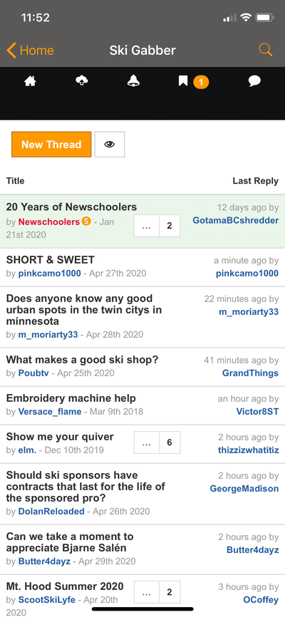
Dr.ZorkoWe liked it at the bottom too, but an issue popped up with new devices having conflicting home sliders. Check out this thread: https://www.newschoolers.com/forum/thread/875525/NS-App-Menu-Items-Not-Accessible
Some users could not access the buttons. As a quick fix, we made the buttons bigger and it worked. But that developed another issue, the menu bar unnecessarily taking up more real estate on screen, cutting off content and cropping certain ads. https://gyazo.com/c3dc38ec4fc681ec23a5df21eea0cdad
We appreciate the feedback but in this case and at least for the time being, we'll be keeping the menu at top and working on making it follow scroll. Hope this helps and feel free to suggest other alternatives!
