It looks like you are using an ad blocker. That's okay. Who doesn't? But without advertising revenue, we can't keep making this site awesome. Click the link below for instructions on disabling adblock.
Welcome to the Newschoolers forums! You may read the forums as a guest, however you must be a registered member to post.
Register to become a member today!
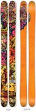
I'm tired of all the new skis having 3 colors and a couple of company logos on them. I wanna see more Hellbent-esque skulls and headless horsemen or Freddy Krueger merking a bitch.
Armada is all into that now, and ON3P's custom designs. K2 is in that area with the retro stripes, but the nicest one were the most recent K2 shreditors' design.
IDK, as mentioned, some brands are hitting it out of the park, another example is Line, Pollard's stuff always is great, as is Bentchetler's But I really miss the kind of busy Schmies graphics, like the Hellbent, etc, that had a bunch of small elements that all came together.
I would argue that the ski industry, as a whole, is making prettier skis now, than 5-8 years ago, even if some of the ones with the most personality are no more.
I’ve seen this exact thread so many times and it bores me every time.Tons of companies make cool graphics in a variety of styles. If you don’t think that you aren’t looking hard enough
Dude, freeskiing (and skateboarding and pretty much any trick based sport) has grown out of the “gnarly graffiti cartoons” aesthetic by now. Modern graphics are cool in their own right, look at Line’s new stuff
RedrobinI'm tired of all the new skis having 3 colors and a couple of company logos on them. I wanna see more Hellbent-esque skulls and headless horsemen or Freddy Krueger merking a bitch.
4FRNT has had some of the most artistic and both aesthetically pleasing graphic designs in their recent lines of skis. Very clean lines and no obnoxious colors, just simple but also cool designs. the last year they made the YLE's had a cool graphic and the limited edition giant alien monster graphic they had on the Devastators once are insane too. My favorite skis ever and skied as great as they looked
f100prerunnerUnpopular opinions: on3ps skis are rather average looking except for BG’s and custom topsheets.
Moments new graphics especially wildcats are sick.
I got downvoted to shit for saying this same thing in that topsheets thread
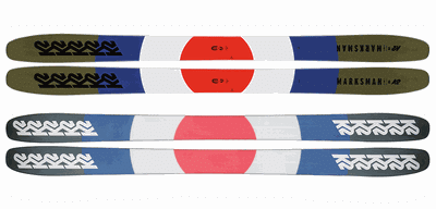
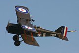
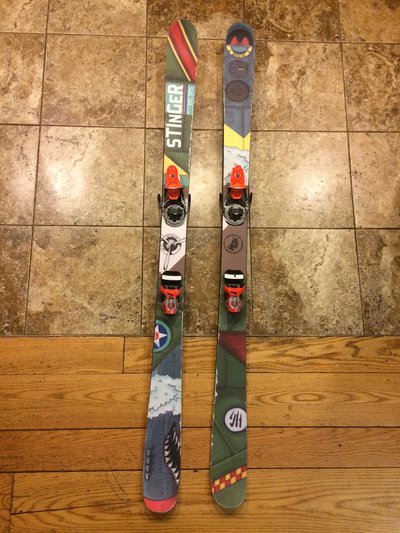
SteezeOnAJawntThe 2020 Marksmans are dope.. I mean like who would think to put a world war 1 allied plane Insignia on a ski?? If u dont get that heres a pic:
K-Dot.I got downvoted to shit for saying this same thing in that topsheets thread
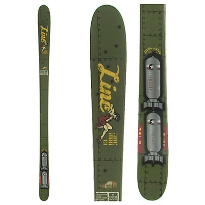
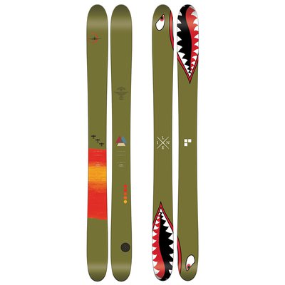
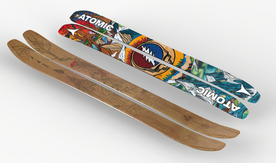
Line sort of already did it first in 2003...
And then HG recycled the idea in 2015
True but those are world war 2 and are meant to look like they took parts off the plane with nuts and bolts and pin-up designs on the skis while the marksmans did an emblem no one has done before on a clean topsheet without images of nuts or screws or writing
SteezeOnAJawntTrue but those are world war 2 and are meant to look like they took parts off the plane with nuts and bolts and pin-up designs on the skis while the marksmans did an emblem no one has done before on a clean topsheet without images of nuts or screws or writing