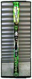
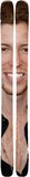
Recently, I was in a touring group that also gave us rentals.
They were more of a green color, and were an older model, but these were essentially it:

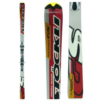
I'm sorry to whoever designed these skis, but holy fucking shit, are they disgusting.
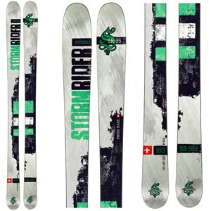
Why does every directional ski that isn't from a freestyle company have to plaster their name in fucking italics on the tip and tail?
This shit looks like the design on a foam cup from the 90s. Even that would look better than this powerpoint template on a ski.
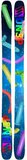
Is it that hard to put something genuinely interesting on the topsheet?