It looks like you are using an ad blocker. That's okay. Who doesn't? But without advertising revenue, we can't keep making this site awesome. Click the link below for instructions on disabling adblock.
Welcome to the Newschoolers forums! You may read the forums as a guest, however you must be a registered member to post.
Register to become a member today!
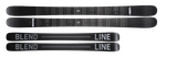
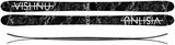
noticed this similarity when I saw the 2019 line blends, the line logo is just like the how the vishnu logo is, with the line through it. Thats kind of like vishnu's thing and I hadn't really seen anyone else doing it, what do you guys think?
Jskis is copying line skis. They both have skis in the name and make stuff to slide down the hill. I heard the guy who started jskis stile theidea from the line guy.
NO BUT JSKIS IS COPYING VISHNU - JLEV I"M CALLING YOU OUT. HAVE YOU SEEN HOW SIMILAR SOME OF THE GRAPHICS ARE??? AND THEY"RE NOT THE ONLY ONES HE"S COPIED, THERE"VE BEEN HEAPS!!!11!!! EVERYBODY BOYCOTT JSKIS IMMEDIATELY!!!1!!1!11!!!!*
*side note, does anybody still actually buy jskis?
Graphic design is hard - and lots of people have similar ideas. If you go out and look, you can find similar products and visuals all over the place.
A line through a logo isn’t exactly an original or never-been-done-before design, and a complete guesshere, but the line through the logo here makes sense with the thematic choice. Most of you young people might laugh at the idea of cassette tapes, but somehow I'm old enough to remember them before CD's showed up on the scene. You could record over tapes and put different music on them, and when you did, you would cross out the name of the old music on the tape and replace it with whatever the new recording was. That is the vibe I get here - though it could be something else, or nothing at all. Sometimes things are just done because the look cool.
And as I said, graphics often share elements with other graphics. That does not indicate that it was intentional or malicious. Just as, say in the case of this 2016 ON3P Prester, the graphic features stacked cassette tapes. Though similar, I have no reservations in the belief that both artists came to the graphics independently. If you look hard enough, you can find similar designs all over the place.
I wouldn't get too worked up over it - these things just happen.
iggyskierGraphic design is hard - and lots of people have similar ideas. If you go out and look, you can find similar products and visuals all over the place.
A line through a logo isn’t exactly an original or never-been-done-before design, and a complete guesshere, but the line through the logo here makes sense with the thematic choice. Most of you young people might laugh at the idea of cassette tapes, but somehow I'm old enough to remember them before CD's showed up on the scene. You could record over tapes and put different music on them, and when you did, you would cross out the name of the old music on the tape and replace it with whatever the new recording was. That is the vibe I get here - though it could be something else, or nothing at all. Sometimes things are just done because the look cool.
And as I said, graphics often share elements with other graphics. That does not indicate that it was intentional or malicious. Just as, say in the case of this 2016 ON3P Prester, the graphic features stacked cassette tapes. Though similar, I have no reservations in the belief that both artists came to the graphics independently. If you look hard enough, you can find similar designs all over the place.
I wouldn't get too worked up over it - these things just happen.
I’m not saying there’s a huge issue with somewhat copying a certain design (theoretically, whether you meant to or not, you still did it). But if I were a graphic designer for a ski or something, I’d much rather have a rather boring design than base my idea of another company’s design, especially if it’s a ski design.
iggyskierGraphic design is hard - and lots of people have similar ideas. If you go out and look, you can find similar products and visuals all over the place.
A line through a logo isn’t exactly an original or never-been-done-before design, and a complete guesshere, but the line through the logo here makes sense with the thematic choice. Most of you young people might laugh at the idea of cassette tapes, but somehow I'm old enough to remember them before CD's showed up on the scene. You could record over tapes and put different music on them, and when you did, you would cross out the name of the old music on the tape and replace it with whatever the new recording was. That is the vibe I get here - though it could be something else, or nothing at all. Sometimes things are just done because the look cool.
And as I said, graphics often share elements with other graphics. That does not indicate that it was intentional or malicious. Just as, say in the case of this 2016 ON3P Prester, the graphic features stacked cassette tapes. Though similar, I have no reservations in the belief that both artists came to the graphics independently. If you look hard enough, you can find similar designs all over the place.
I wouldn't get too worked up over it - these things just happen.
Yep what mr iggyskier said, always going to be something similar with like-minded brands and the amount of ski graphics being put out on a yearly basis. - josh @ line
Line_SkisYep what mr iggyskier said, always going to be something similar with like-minded brands and the amount of ski graphics being put out on a yearly basis. - josh @ line
You guys should bite on brand on purpose next year. Just stir the pot because it's funny.
Line_SkisYep what mr iggyskier said, always going to be something similar with like-minded brands and the amount of ski graphics being put out on a yearly basis. - josh @ line