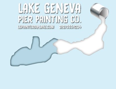
Notes: The odd shape that the paint is pouring into is the shape of the lake
It is a pier painting company, so anything you think could get that across more, let me know.
Welcome to the Newschoolers forums! You may read the forums as a guest, however you must be a registered member to post. Register to become a member today!
eheathThe bottom part is very empty, either fill something in there or cut it out.
Laurent.It's shit.
I'm not being mean here, just realistic.
The font is atrocious, the kerning is madness, too much text, the sweet shadow outlines and gradients are a bad idea, the shape is...strange.
The environmental message portrayed is conservative and it's all in all very 90's.
I'm not going to write a long thesis on logo design but in essence a good logo is recognisable when printed on a twenty year old laserprinter with arthritis on it's last breath of toner. Start in black and white, only black and white, absolutes before thinking about colour. Design a logo is easy, designing a good logo is ridiculously hard.
Laurent.Design a logo is easy, designing a good logo is ridiculously hard.