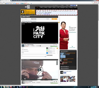
This is not a section I lurk in and I'm sure this point has been raised before. but here it is again from my perspective.
Forgetting how bad our photo section was I went there for the first time in years. I was genuinely shocked that the icons are still really small and I have to click on each photo individually. Once clicking I can't even click an obvious link to view the next photo. This is as old school as it gets.
Fixing this needs to be a priority. lets look to photo streams that work well.
Instagram is pretty much king. if there was an app that was like instagram but it was actually just the ns photo section, i would use that shit! If the ns photo section just worked in a similar way I would also use it!
Tumblr, that's alright too, hey this is 2015, you could probably make the section like tumblr but with the option to change the theme. you could have infinite scolling instagram style or different sized tiles, you could even make more popular photos bigger. many choices. all better than what we currently have.
Is such an out dated style of photo gallery available anywhere else on the internet? Surely not anywhere with this number of users.
A quick word on blocking ads

It looks like you are using an ad blocker. That's okay. Who doesn't? But without advertising revenue, we can't keep making this site awesome. Click the link below for instructions on disabling adblock.


