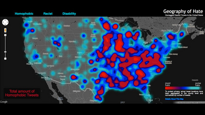
The map didn't pull up too good on my phone but this study is pretty interesting. The map highlights where hate tweets are generated from. It's not surprising it follows population trends but still pretty cool to see to say the least.
http://abcnews.go.com/Technology/geography-hate-map-racist-homophobic-tweets/story?id=19178370
A quick word on blocking ads

It looks like you are using an ad blocker. That's okay. Who doesn't? But without advertising revenue, we can't keep making this site awesome. Click the link below for instructions on disabling adblock.


