THE TRUTH:
I woke up one day about six months ago and realized you were all right, I was all wrong and I absolutely fucking hate the new logo. Old logo was way better, new logo sucks.
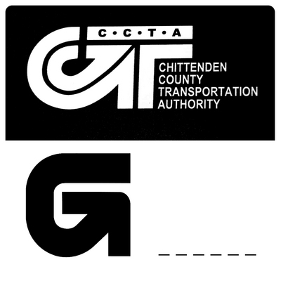
You were right, I was wrong.
I love the stacked text though, and the old logo is really, really old. So in a quick stopgap measure, we simply ditched the new logo.
Enter netsteps....
This is honestly the first I've ever seen of this. The similarity is uncanny, and this is either the biggest case of co-incidence I've ever seen, or their guys somehow copied us. We had our logo custom designed by
http://www.cresusdesign.com back in about 2008/2009.
Lots of people use super cheap logo designers who just copy other stuff. That is why when you get a logo designed and find out its going to be like $10k you get shocked... "BUT MY COUSIN COULD DRAW A LOGO FOR $200" or "I COULD GET THAT AT 99 DESIGNS FOR $100" - basically means someone else will copy another logo that isn't unique.
Who knows, and who gives a shit. ITs a crappy logo anyway. Served its purpose for a bit, but I'm over it.