It looks like you are using an ad blocker. That's okay. Who doesn't? But without advertising revenue, we can't keep making this site awesome. Click the link below for instructions on disabling adblock.
Welcome to the Newschoolers forums! You may read the forums as a guest, however you must be a registered member to post.
Register to become a member today!
Simple is better than busy and darker colors usually.
I fucking love my empresses. Black with any color looks sick as hell.
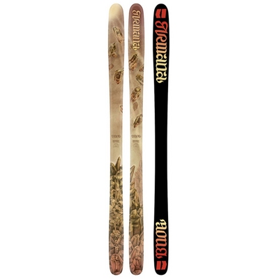
Also, I love last years arw's cause they're really simple, and I like the owl and horse. I usually don't like lighter colors but there's just something about these skis that I really like.
I feel like some designs are just too busy and it looks bad a lot of the time.
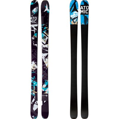
I'm not a fan of Line's design on the Celebritys. There's just so much going on but a lot of people really like it so maybe it's just me.