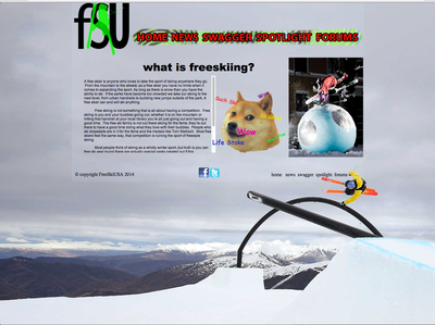
meme's are dumb, don't use them to explain/promote a sport that is just now getting it's definition from "mainstream" even if you and your friends use the meme to make fun of skiing, I wouldn't want doge to be onw of the first things people associate with freeskiing.
why red outlined text for your nav bar? pick a color from your background image ( I'd use a background image that has more color to it/ isn't a shot form a cloudy day) ... also, very few people will recognize that shape as the base of a ski and not some weird blob bar thing. and "SWAGGER" .... really?
use a java light box plug-in, or a html photo gallery plug-in to have photos of all the different kinds of freeskiing (if you're making a real page, if you're making a web lay-out in inDesign or PS, make a frame for your photos to sit in, with indicator symbol below. also there are more photos of freeskiing than hand drags..
lastly, you footer need more room on the bottom from the background image, you should use a sans-serif font in the footer if you're sticking with sans-serif body copy. and your social media icons should be the same size.
you understand hierarchical content layout, but need to work on design continuity.
I'd do it like this:

