Hey everyone -
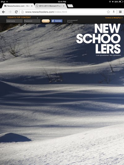
We're launching another part of the puzzle of the whole re-design to Newschoolers, and that is a new splash page. While in beta it is going to be disabled by default, but after we work out the kinks we're going to put it back up as the default setting. Still customizable for those of you who don't like it of course.
The key concept is that this is a layer on top of the whole sorting system you've all become used to using. The cover of the site is no longer just a photo, its got a single item from each content category that is the top rated item of the day before.
The influence of this idea was taken from print magazines, yet applied with a more dynamic, modern web philosophy and mixed with the whole Content community UGC madness we have going on around here.
Hope you like it, feedback welcome.
A quick word on blocking ads

It looks like you are using an ad blocker. That's okay. Who doesn't? But without advertising revenue, we can't keep making this site awesome. Click the link below for instructions on disabling adblock.


