I'm not necessarily a mountain/skiing oriented designer, but its a huge part of my personality - if it wasn't for skiing, I would have never gotten into design and media. I'd probably be in dental school right now resenting the world haha.
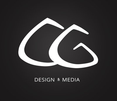
I really appreciate your feedback tho, it really helped me re-iterate on this. I think this one is a lot better than the last one, it needs a little more work, but I think it looks a lot more developed. I took out a bunch of anchor points and smoothed the other ones. I think the last one was too thick and the edges were too round, making it look more like a permanent marker. It also didn't have enough contrast between widths, it had contrast, but it was weak. So with this one, I thinned it a little, and made the thin sections really thin and the thicker sections relatively thicker.
I still doubt that the "CG" is really recognizable, but I think the logo itself is recognizable and gives the feel that I'm looking for (creative but professional - that's probably how all designers classify themselves haha). When people read my name they'll be like "Ohh CG," at least that's how I am when I look other designers who use their initials.
You were 100% right about the ampersand, it looks a lot less cluttered without the line.
Here's the newer:


