And this:
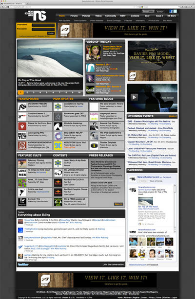
So I realised that those pics date back from 2010 (at least the screenshot, in upcoming events, says 2010), so was NS like that once? if yes then why the hell did it not stay like that? I love the way that theres a lot of featured stuff like cults (i never go on them cos i only know a few that r awesome), a facebook feed along with some twitter shit that looks nice, and not only the most upvoted stuff.
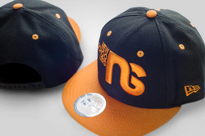
second, why are the hats not like the one above now? newschoolers on the side looks dope and orange is a sick colour (I'm kinda pissed, just bought the red hat, this one above looks way better)
Anyway, really hoping that NS home page will look like that in the future (again?) so people who only go a few times a day don't miss the good articles/cults/events.


