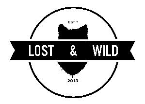
I cant say a ton about the clothing as it is far from my area of expertise, but I think I can take a look at the Logo you have used on the site/FB page.

I get the feel you're going for with the ribbon and circle I just think that it could be better refined. I am not too sure what program you used to create this but I think having it done up in a vector format would be really helpful to eliminate the rough pixel look to the edges. In addition to this I would look at the tracking of the text "Lost & Wild", I am not sure if you intended to have so much separation between each section of the name, but I feel some additional space (+10 or +20 tracking?) in the text would lighten it up a bit and provide a bit more unity to the name. Lastly The image behind the ribbon, I am not too sure what it is meant to be? My first thought was a shield, but I now think it may be a wolf's head silhouette due to the furry look on the edge.
Again, I really think this logo needs to be done up in Illustrator or some other vector based program to eliminate the jagged pixel look everything seems to have. I think it could be a pretty nice logo, it just needs some polishing and a bit of refinement.
In regards to the website, there is still a lot of work to be done, I'd recommend taking a look at your CSS and trying to get all the text sized figured out, Footer text can be quite a but smaller than headline text, body copy can be smaller with a bit more leading. I also see the "View Basket" button as sitting over top of your navigation bar, this can probably be fixed with some positioning commands if nothing else. The last thing I'll say is please find some proper Facebook and Twitter icons, using distorted images really brings down the look of the site and does not look professional at all.
