First off i8van - man let me tell you I've always loved everything you do.
Second - we love suggestions. Aren't you close (ish) to us? We should have you up sometime for a session when we're actually doing changes. It would be cool to have someone like you offer opinions during the design process.
Third - please, please, please - open your mind to what I'm about to say.
Now:
The one thing that drives me the most crazy in the entire universe is Graphic designers who make pretty pictures of websites and say "See? I did better." Pretty pictures made in photoshop are extremely easy to make, but they totally ignore a huge amount of functional realities when you're taking into account a website that has lots of members, legacy functionality and a business to run. Without taking these things into account, the pretty pictures are absolutely meaningless, and can simply never be transferred into reality. When they can be transferred into reality they often don't look as pretty as the picture that the designer originally made.
Having said that, I understand that what you're doing is making suggestions. That is perfectly fine, but its important as well that everyone realizes that these types of things are suggestions. When you come to the final product, it is after taking all of the other factors into account.
So lets start:
"The biggest problem area I find is information hierarchy on the site, as more and more elements have been added on and few of the elements have been removed, therefore resulting in a cluttered layout of the site and inconsistency across home,media,forum and other modules."
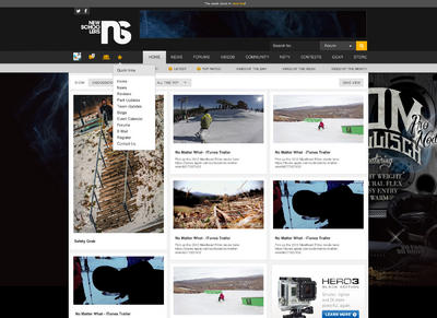
The inconsistency is something that we know about, and is something that is being addressed section by section. We made the decision a few years back to section-by-section do complete overhauls which would upgrade technology, unify design and fix outstanding issues all at once. Each section would be left with only bug fixes until a massive overhaul was completed. Homepage set this trend, and all other sections in time will be changed to use this style. This makes for a very functional business, as we don't overspend and we keep people happy.
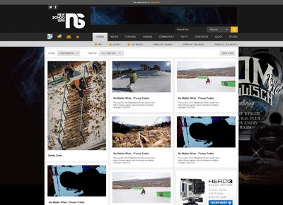
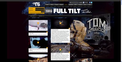
"First, the latest home page. I understand it's a huge canvas for advertising, but I feel it's a little overwhelming and has made it impossible for me to enjoy the content(especially with splashy ads like Saga's). The layout I'm proposing is designed on a 960 grid and is actually about 40px narrower that the current website. It still allows for standard skin+leaderboard+bigbox website takeovers, but eliminates massive spacing between each "article/photo/etc", which create the biggest visual conflict."
(also reference your "01_home.jpg" image)
You can't just magically shrink newschoolers by 40px. To do this, we would have to re-write all the templates of absolutely every single section of the site all at once. That would be great, but we actually used to do this and what we found is we would waste entire summers simply changing the templates and design, but not actually getting at any of the core functionality. So the 40px width would come at the expense of tonnes of features. When we sit in a room (and if you were there) I would be staring into the designer's eyes saying "Do you agree that cutting 50% of the suggested bug fixes is worth your 40px?"
What ususally happens (and has happened) is that the designer and all those involved will agree that 40px doesn't make that much of a difference. So we stick with 1,000, which is what its been at since the last time we overhauled the entire site to get extra width from about what you were suggesting. Hell, we even thought about doing this for the sake of less room between the modules, but it was voted that it would sacrifice too much.
Next with the homepage, your design does not take into account Forum threads. You do not have icon images for forum threads, and we believe that forum threads are some of the best content on NS and deserve to be on the homepage. Lots of the perceived 'organization' of your design is coming from the fact that you have everything almost perfectly horizontally aligned. Add forum threads into the mix and it would make your grid look a lot less clean.
Ads. First off, you can't put the 728x90 in the header, and you can't put the 300x250 low like that. Sure its better for design, but it sucks for advertisers. They are trying to sell product, and in order to pay for a site like NS we need ads that have a good solid focus. Note too that there needs to be 300x600 ads that can launch into the 300x250 spot. Your layout should support that as I can see that you didn't horizontally align the big picture on the left, but again if you had that in here it wouldn't look so clean.
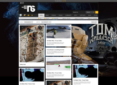
Skin. I understand that you'd like to cut down on the real estate of ads, and that taking away the skin that went through the header, and bled into the content area makes it a bit cleaner. However, that makes it a drastically shittier ad. In the online landscape, you're frequently competing with Print advertising, where people tolerate two-page spreads. Spreads are amazing because they enable the company to pull of branding. They get lots of real estate, and can make something that emotionally tugs at you, that isn't just a flashing animated .gif that states 'click here' in fluorescent letters. The reason that we created something where the advertiser gets more real-estate is that they're able to come up with a much cleaner design. Sure we have some educating to do for sure, but when we see stuff like this it makes a lot more sense:

If I'm Line skis, I actually like our setup a ton better than yours. Your design is very bad for branding, and doesn't have a way for a brand to command a significant portion of the real estate. You're going to have mis-matched ads, a different skin, and a way higher propensity towards flashing crappy creative.
We're trying to fix the model of online advertising, and its working. Stuff like the Line takeover is the future, and companies are actually able to build their brand with web advertising. Its selling fantastically, and helping NS stay stable as a business.
Now, in our design the descriptions are too long. You'll notice that we shifted them to 3 line only descriptions, similar to what you have. This was a mistake on our part, and we realized it.
Icons - Not all icons are the same size. Again, your design assumes that you have exact-sized icons for everything. We are capable of thumbnailing things and creating this, that is very true, however the decision was made to allow originally-shaped icons to dictate the size.
The reasoning behind this is that as soon as the model of horizontally-aligned content breaks, and you have a couple of things that are outside of it - it just looks like you have broken horizontal alignment. Since we couldn't get horizontal alignment perfect, we decided to abandon it completely and go totally in the other direction. That way, you have vertical alignment and a beautiful sense of organized chaos horizontally. Its a different philosophy behind beauty.
I know that you put the white background box into the homepage to make it fit with the other pages, but that is going in the wrong direction. WHat we're doing is removing the white-box based templates everywhere else on the site so that it is all more based on a floating-style design. Certain sections like the forums will always have to have a certain amount of white-box based chunks, but the rest of the site will match the HP vs. the other way around.
So you must think of the future. You can't design a site like Newschoolers in the past or even in the now - you must think years down the road. The new HP braves in a bold new direction.
People freak out at too much change. Even if we could have changed all the sections at once we likely wouldn't have. This way, we push out a radical new design in one place - that works much better for your average person - and core NSers stay with the design they're used to. Then bit by bit, we make the rest of the site match our piece that is our 'beach head' into the future.
You must be very strategical about how you release changes, especially major ones. Every site has ways to do it, but you must think about your users and can't just jump to something without having an overhaul path planned out.
Same goes for the orange box that holds the login/etc. Believe me, that thing is on our list of 'horrible legacy' items that badly need to be modernized. Trouble is, that is core navigation for a massive amount of users on the site. I mean the day we switched the order of ski gabber, Non-ski gabber and Site Discussion in the subnav, there was practically riots. People have muscle memory for how they use the site.
The reason I mention that, is that leaving something that is really familiar like the Orange module is a great way to make users feel more comfortable within a slightly new environment. So the homepage was a very radical change, but as soon as you went to the top of the site you felt right at home. Intentionally we leave legacy things in place to make a user feel like they have an 'escape hatch' back to friendly places. Homepage too different and freaking you out? Abort to quicklinks, or mouse over Forums and click Ski Gabber.
So in closing about the homepage - you have to remember that absolutely everything that we have done has been thought about in painstaking detail. We are creating a new future for Newschoolers, and we need to be very strategical about how we do that. Everything that is there is a balance between all the needs of Newschoolers as a business - from new paths, to community usage to design to advertisers. Everyone won a little bit.
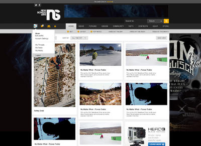
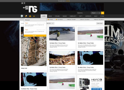
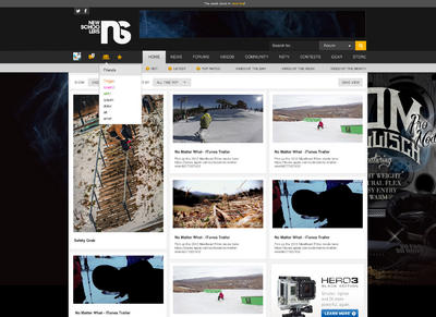
As for your suggestions about Icon/friends/messages/quicklinks -
I love this design. Its a great idea for how we can do this. We will be re-designing this module eventually, and I'll put these suggestions into the mix. Huge goal of ours is to create a really nice module here. I do think though that something it really needs is a quick way to add content to any section. Maybe that is just a homepage thing, or maybe its an everywhere thing - but that is such a core part of the new Newschoolers that it might deserve mention.
So bravo!
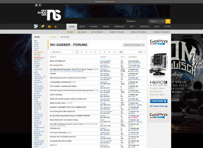
The forum design isn't much different. I'll tell you that rendering those headers and pagination differently means doing it across the entire site. That makes it possible, but we have to make sure that we're taking into account absolutely everywhere those changes are made. As well, this page you've basically mostly re-designed the header which doesn't work for a lot of what we've done, based on my points about the homepage.
In closing, the most important part is to work with the tech / business side before suggesting designs. So many people (our designers included) suggest designs that have nothing to do with the business, user interface or technological realities of the business. Designs must take these things into account, and if you want to get deep into it then pre-talk about that stuff before just sketching up a few pretty pictures.
If you feel like it, I'd love to see more designs that take this into account. We'll certainly look at them, and if you were in Montreal I'd absolutely love to have you by the office for a deep dive on the rest of the website. Most of NS is going to be moving in a design style like the homepage - floating boxes vs. white background - so making suggestions of other pages to look like that is sweet.
I do appreciate it when we get suggestions, its just hard when we get suggestions posted publicly that take zero things into account about NS as a whole.
