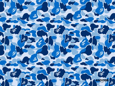
The only similarity is that it's a camo, and has blues in it. Yea, Thomas showed me that, but not until after I had already completely the camo pattern. Those blobby shapes are ugly, definitely not a fan of BAPE as a brand or from a graphics standpoint.
The Camo that we did for this ski is completely from scratch - Here's a rundown.
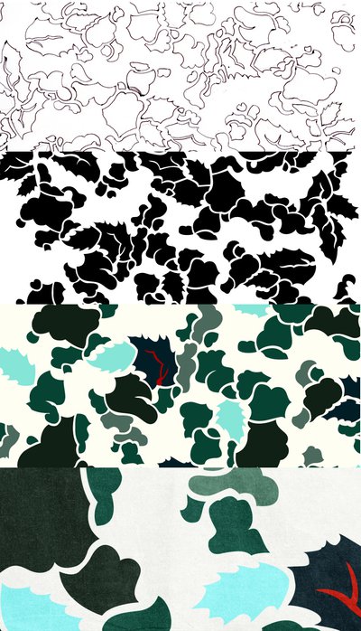
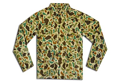
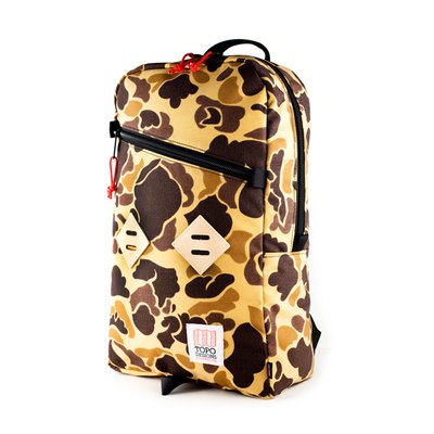
Pete and I started talking about this project over well over a year ago. When we came up with the idea to do a camo, I was hesitant - it's not my thing. I found some camo patterns that I did like, and looked at why they were appealing. Took those traits and attempted to translate them into a camo pattern that stuck to the characteristics of a traditional duck camo, and inject elements that made it applicable to the PNW - namely those cool greens, and the leaves, which are abstracted from the leaves of the Oregon Grape (The state flower)
1. Sketchbook - lots of pencil, lots of erasing, penned the outlines.
2. Illustrator - scanned in the sketch, traced it in illustrator
3. Color - colors taken from PNW foliage and my impressions of it.
4. Cordura application - Scanned a service issue canvas military tarp my from WWII and added the texture.

as you can see, the only similarities is that it's a little blue, and the shapes don't overlap and in fact sit on a background, unlike other combat camos and tiger camos.


