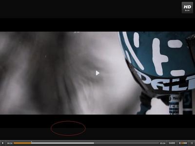
The only thing that has been bothering me is the shade of black used in the top and bottom bars. It is lighter than the blacks used in letter boxing and titles, so it looks a little odd. I'm probably being obsessive over something that does not matter, but has this stood out to anyone else?


