its really easy to navigate and a simple design, which I like a lot
what you could work on is trimming excess "wieght"
this website shows all your best work, so you might want to go back and think "do I really want this photo to represent me?"
also one more little thing thats just me being weird but maybe when cutting down, if you decide to do that, make the photo pages have an even number of photos, heres what I mean:
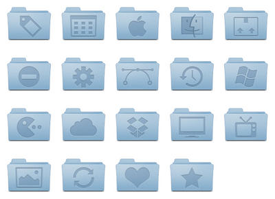
Right now it looks like this, with empty space:

when I think it would look a lot neater/professional like this:

(sorry I used folders as the example, I couldnt find pics that represented that with photos :))


