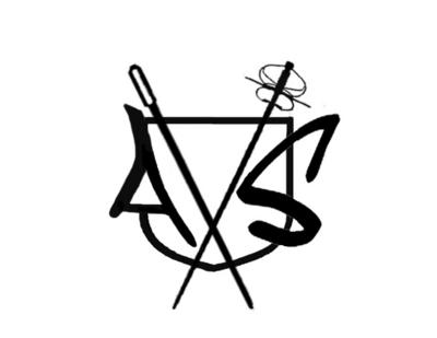
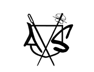
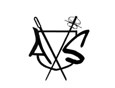
Just been workin on a logo for a little while in photoshop, just thought id get a couple of opinions on a thing here or two. Here are three rough drafts. slightly different versions, the only difference between them is the line continuity through the S.
I'm not sure how to line up the A and the S so they look level, any suggestions on this would be cool
Also, any Ideas on what could go in the triangle formed by the sword the needle and the edge of the crest, if anything? should something go there?
Thanks and +K for specific help


Thanks


