It looks like you are using an ad blocker. That's okay. Who doesn't? But without advertising revenue, we can't keep making this site awesome. Click the link below for instructions on disabling adblock.
Welcome to the Newschoolers forums! You may read the forums as a guest, however you must be a registered member to post.
Register to become a member today!
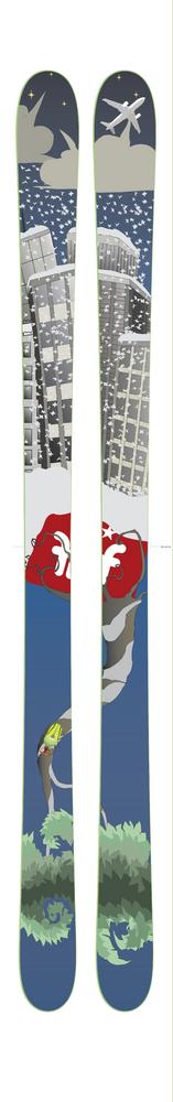
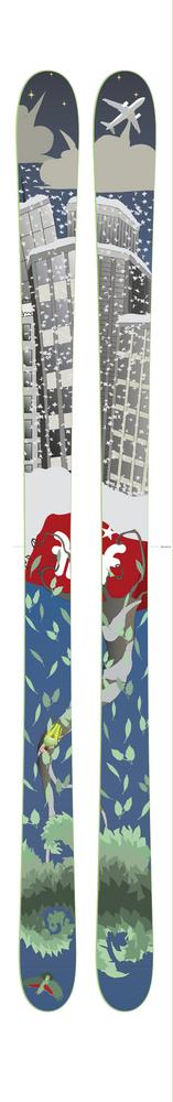
I like the design and would by the design for sure. If you moved the buildings a little further up the tip to remove them from binding placement it would help
its too busy! theres too much going on on that graphic. you should have went with one of your previous two. also i hope you changed your base graphic. no offense but i think the graph looks hella gay and corny and what not. just a straight up faction logo would do. maybe do it up the bottom of the ski kinda like 07/08 Eliies. where it says LINE when you look at em.