


Welcome to the Newschoolers forums! You may read the forums as a guest, however you must be a registered member to post. Register to become a member today!
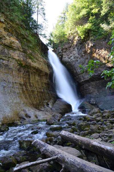

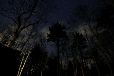

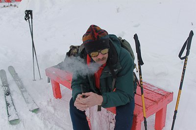


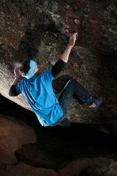
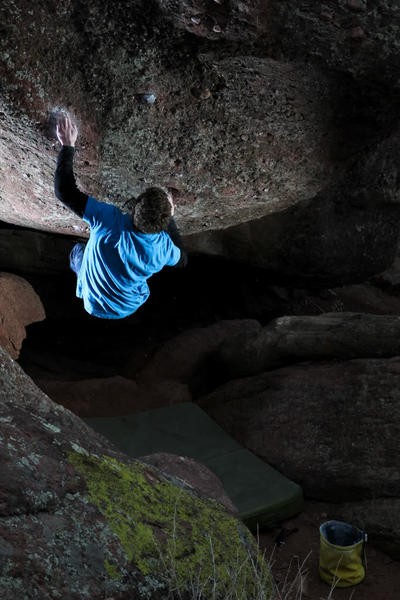
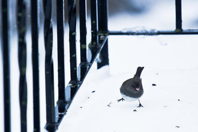
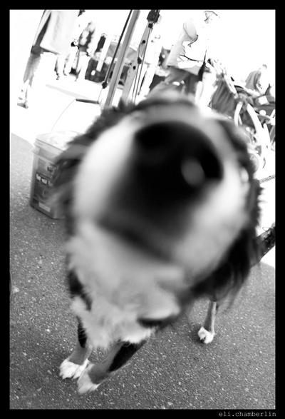
crap quality. the one time I had no tripod :(


