If I had a dollar for every time I've personally heard that someone bought a pair of skis because they liked the graphic...well, let's just say I'd be able to afford a Snowbird Fast Pass on a pow day. Ski graphics can make or break whether a ski succeeds in the marketplace and the threads debating who made the best or worst graphics for a given year have been posted since Newschoolers' inception. The past few years I've been highlighting the best graphics put out by brands and before that, ON3P were holding contests to see who could make the most appalling graphics you've laid eyes on. With all that said, behind every great graphic there is a creative genius who sees the world through a lens different from most.
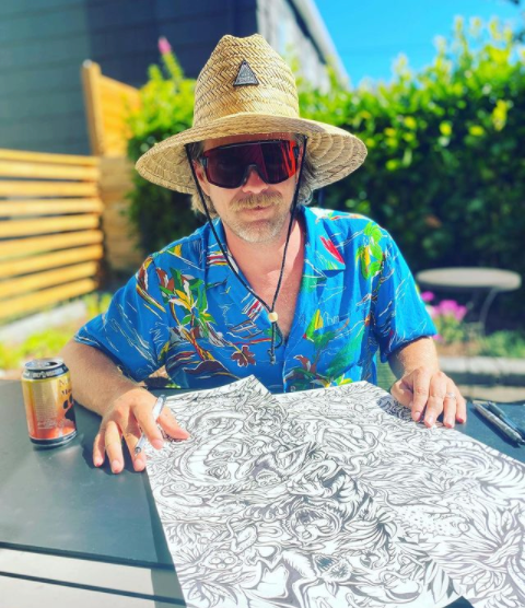
Enter Ryan Schmies. Hailing from the ski mecca of Wisconsin, he joined K2 in 2003 as a graphic designer. Over the course of 13 years, Ryan would go on to create countless (over 400 total) graphics that still stand as some of the best topsheets ever created. Making pro models for Seth Morrison, Sean Pettit, Pep Fujas in addition to graphics for other K2 Factory skis like the Hellbents, Iron Maiden, PBR. He's worked on Full Tilt & K2 boots, K2 helmets, Cody Townsend's FIFTY logo, recently he's done graphics for J, he even worked with Marshawn Lynch on a t-shirt design. If you haven't realized it yet, there isn't much Schmies can't do.

"The analog process for my latest collaboration with @j_skis . I draw everything actual size on good paper using cheap pens. Sometimes cheap paper and good pens. Often I’ll draw with no pants on, but I’m wearing them here because I’ve scared my neighbors and received a terrible sunburn."
The following graphics are just a taste of what Schmies has done over the course of his artistic journey in the ski world.
1. K2 Hellbents - 2008-2013
A classic ski through and through. Charley Ager made a name for himself in the backcountry with these beasts. Stomping everything switch on a 122mm (07-09) or the 2010-2012 reiterations which were 133mm underfoot, full rocker noodles were something else and no one could do it quite like Gnarly Charlie. . I couldn't pick just one topsheet for these so here are all the offerings.

Timeline of the Hellbents (L-R) courtesy of the man behind the graphics:
07-08: 4 Horseman of the Apocalypse graphic. 122mm underfoot. (same year the Pontoon came out.)
08-09: The Dark Rider graphic. Black skis. 122mm underfoot
09-10: 'The Garden of Hellish Delights.' Hieronymous Bosch influenced graphic. Glow in the dark. 122 underfoot.
10-11: Killer Clowns from Circus World Museum. Also influenced by John Wayne Gacey and Captain Spaulding from 'The Devil's Rejects'. 132mm underfoot. (new shape)
11-12: Orange Wisconsin HellBilly Serial Killers graphic. 132mm underfoot.
12-13: Nursing Home on Acid graphic. 132mm underfoot.
Browsing Ryan's site, he has some excellent tidbits of information about certain graphics but my favorite one is in regards to the HellBilly serial killers topsheet.
"This was the 5th iteration of the infamous K2 HellBent. For year 5, I went with a little bit of Wisconsin meets Deliverance. Hillbilly flesh harvesters all done up in a palette of bright blaze orange. This one got some looks on the mountain and well.....everywhere else. I can't even recall the amount of hate mail this generated from angry parents. In the end, it sold out and remains a personal favorite."

HellBilly in full form.

The HellBent finale, the nursing home....but add mescaline.
2. K2 Iron Maiden - 2012 & 2013
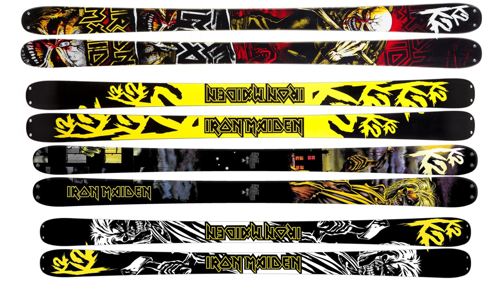
Iron Maiden, one of the most iconic heavy metal bands to walk this planet, teamed up with K2 over several iterations of skis on the Recoil layout. Schmies was able to work on 2 of them which you can see below. Schmies had this to say in regards to working on a graphic for one of his favorite bands.
"Over the course of a few years, I had to opportunity to create 2 limited edition K2 Iron Maiden skis. Being a long time fan, this was a treat.
The Trooper art is absolute iconic imagery from Maiden's 'Piece of Mind' album. We didn't want to just reproduce the existing art onto a ski, so I took the opportunity to illustrate Eddie, giving this classic image a modified look. The final result was a band, team and consumer favorite.
The year before we created our first ski using the artwork from the Killers album. We utilized a 4 color print for the top but I needed to create a base of the same design. Base die-cuts are basically a giant puzzle of interlocking colors of P-Tex base material. You need to be cognizant of cut angle, the size of the pieces, etc. I'm more than satisfied with the end result and I'm pretty sure I pissed off both the factory and the process group with the base complexity."

The 2012 & 2013 (Top to Bottom) of the Iron Maiden skis that Ryan designed for K2.

Eddy ready to melt faces in the pit and in the park.
While the HellBents & Iron Maiden skis are 2 of Ryan's more iconic graphics that he has designed, this article barely scratches the surface on what he has done over his illustrious career. If you'd like to check out more of Schmies' designs from years past from K2, J Skis, Full Tilt, Dakine, Butt Snorkeler, and more, head over to his website or IG. It'll be quite the trip down memory lane for a few of you and a history lesson for most.
---


Comments